Strange Maps
A special series by Frank Jacobs.
Frank has been writing about strange maps since 2006, published a book on the subject in 2009 and joined Big Think in 2010. Readers send in new material daily, and he keeps bumping in to cartography that is delightfully obscure, amazingly beautiful, shockingly partisan, and more. "Each map tells a story, but the stories told by your standard atlas for school or reference are limited and literal: they show only the most practical side of the world, its geography and its political divisions. Strange Maps aims to collect and comment on maps that do everything but that - maps that show the world from a different angle."
featured


All Stories
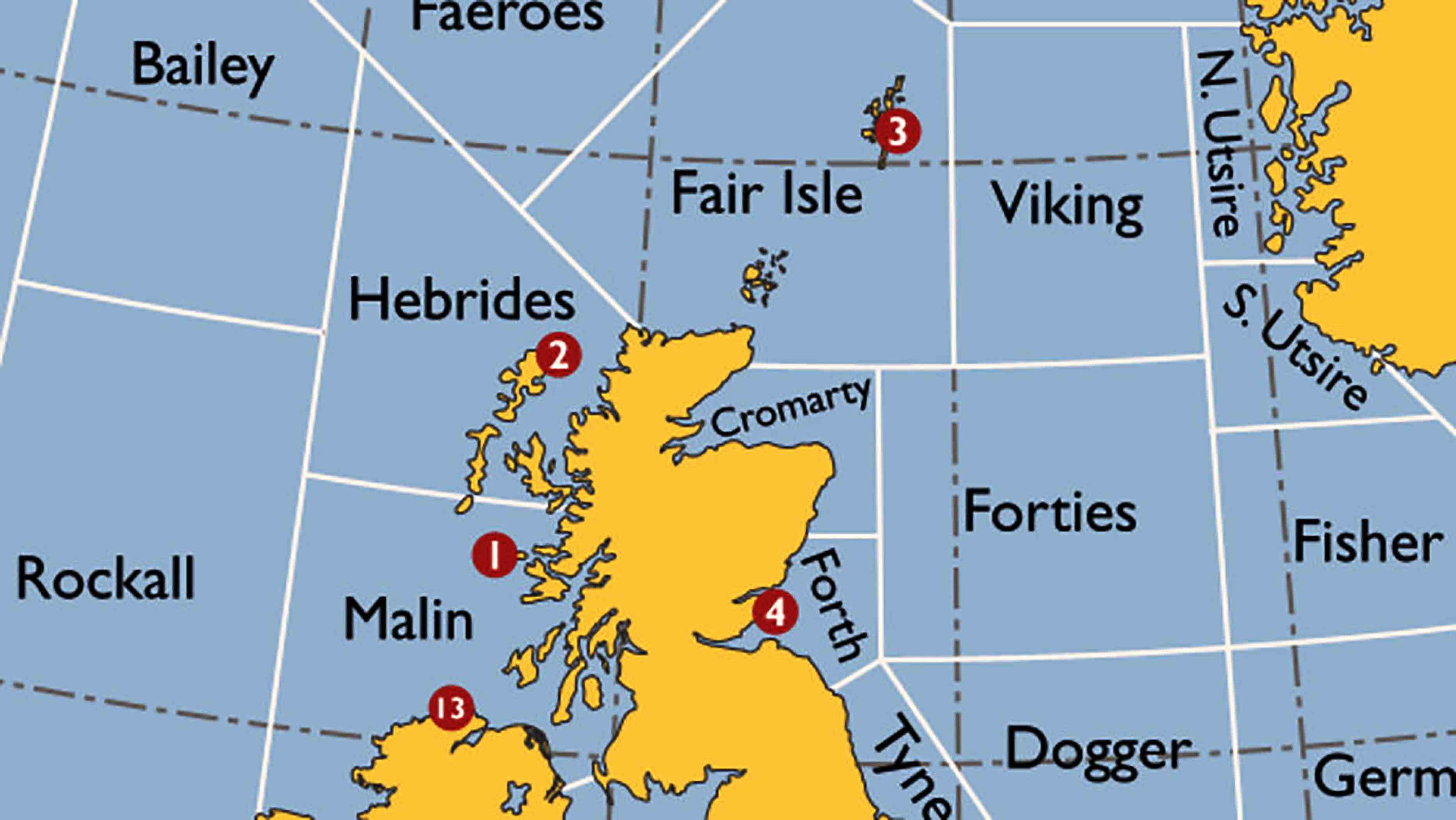
The Shipping Forecast is quite possibly the most British thing ever.
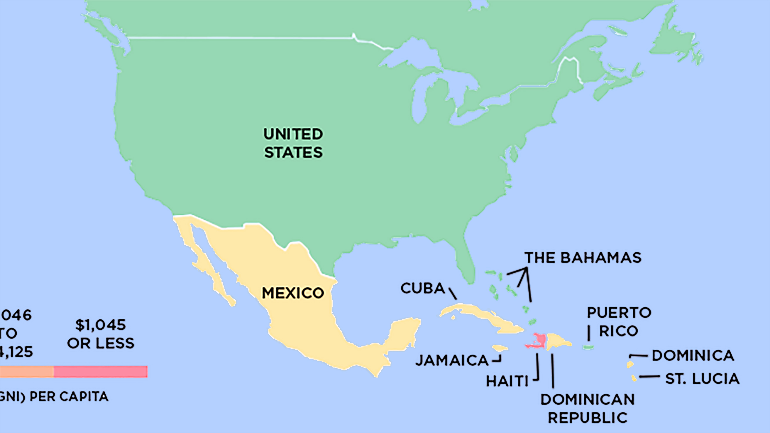
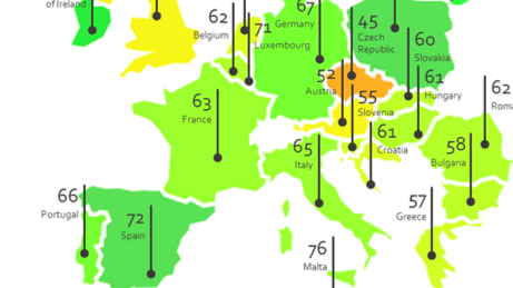
Based on World Bank data, Global Finance magazine recently subdivided the world into four income groups. And here are the maps that illustrate the point.
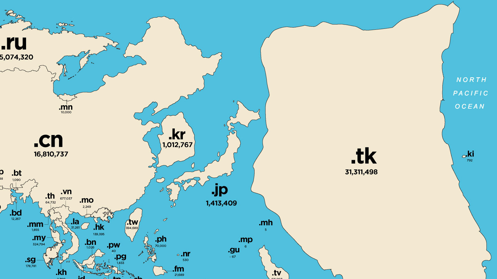
This is a map of the online world. Each country is resized for the popularity of its domain name. The eye is immediately drawn to the map’s greatest anomaly: Tokelau.
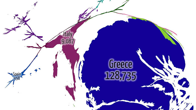
Three maps show how Greece is taking the brunt of Europe’s refugee crisis
Turkish cardinal directions? I didn’t even know they had cardinals in Turkey!
An early ‘viral’ phenomenon, the Jedi faith is fading fast
Londoners are defined by the sounds of their city — and here are the maps to prove it.
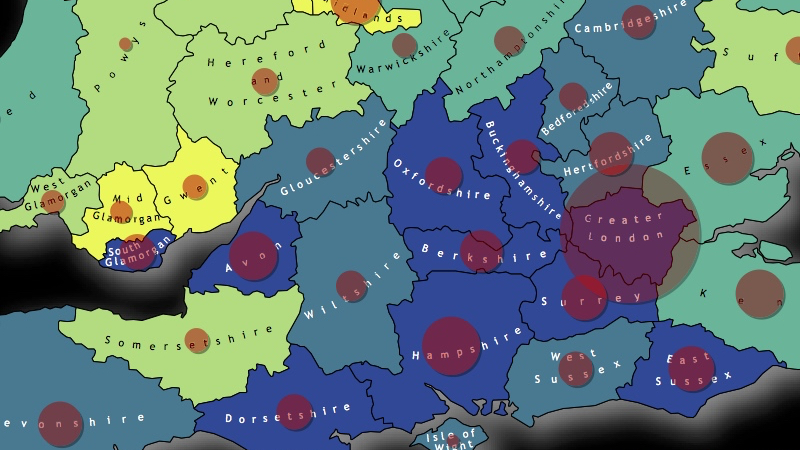
The slippery slope of Britain’s exit from the EU, mapped
A noble attempt at fighting viral racism. But is it telling only half the story?
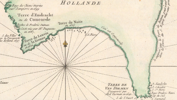
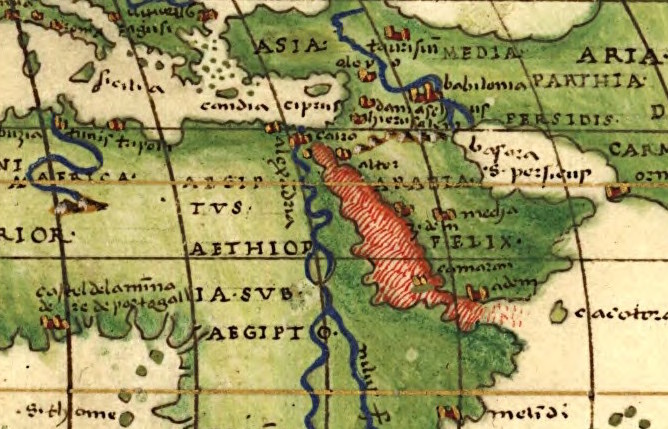
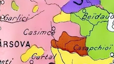
How do you map a half-discovered country? You make up the other half!
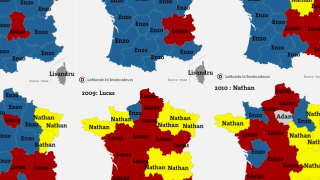
On the map, the changing fortunes of French baby boys’ names look like battles in a weird, unreported war.

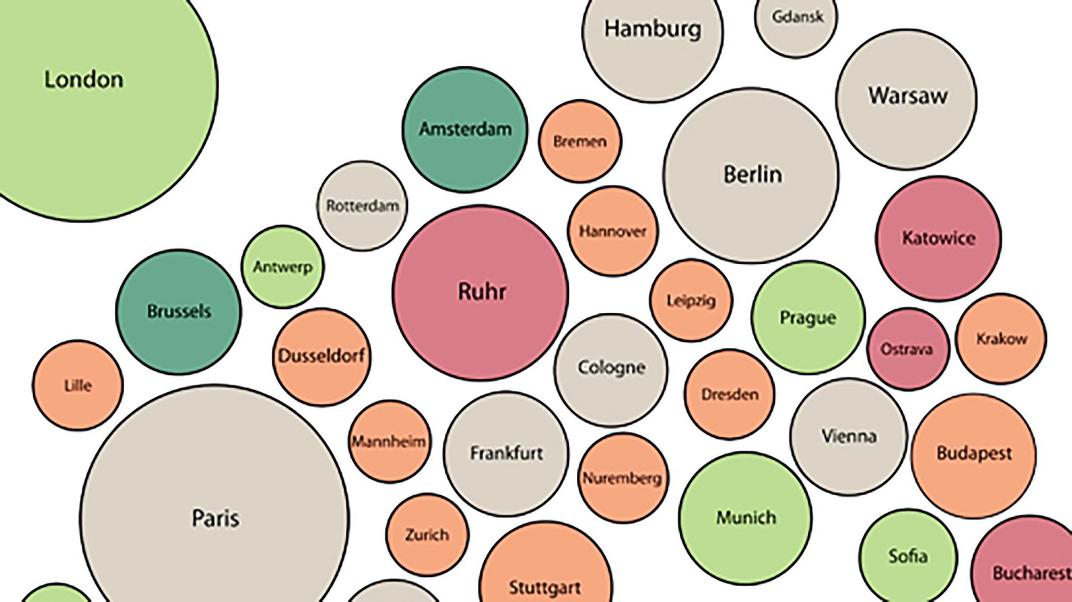
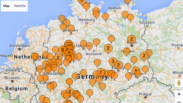
All cities have clogged traffic arteries, post-industrial pockets of hipness, and districts that hate each other’s guts for no other reason than that they’re across the river from each other, or on opposite sides of the tracks.
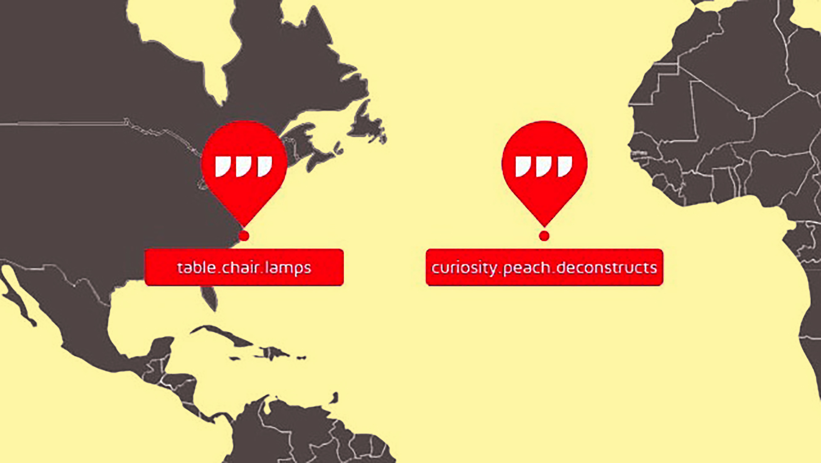
Locate any of the 57 trillion three-by-three-metre squares on Earth with just three words.
This is how the world economy will grow through the year 2024, as predicted by Harvard University’s Center for International Development (CID).
Nothing fans the flames of nationalism like the sense of historical wrongs as yet “unrighted.”

After then-president George W. Bush phoned Jacques Chirac, his French counterpart had to consult a biblical scholar to make sense of the conversation.

Throughout the world, higher incomes translate into less religiosity, and vice versa. But that rule does not apply to the Americans, nor to the Chinese.
Pretty soon, these maps may be as dated as the Bing Crosby song
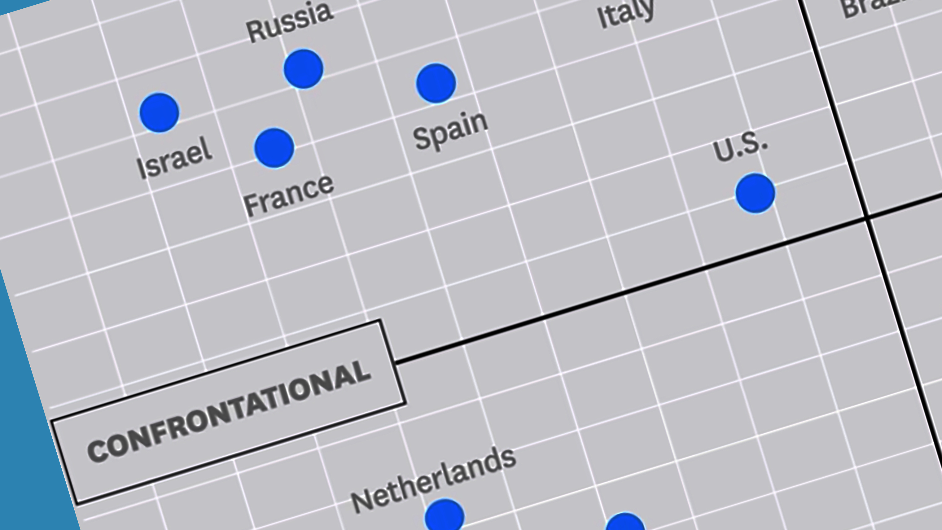
Germans are cold and hard. Filipinos are warm and soft. Or is that oversimplifying it?
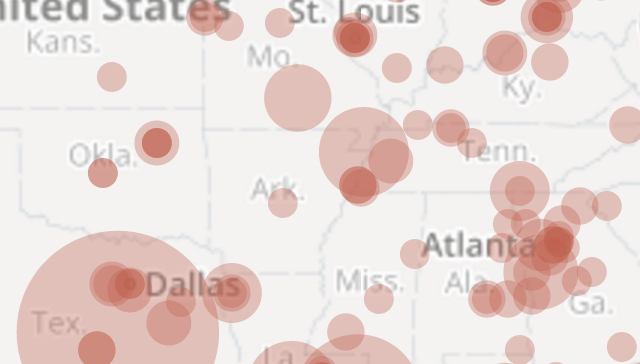
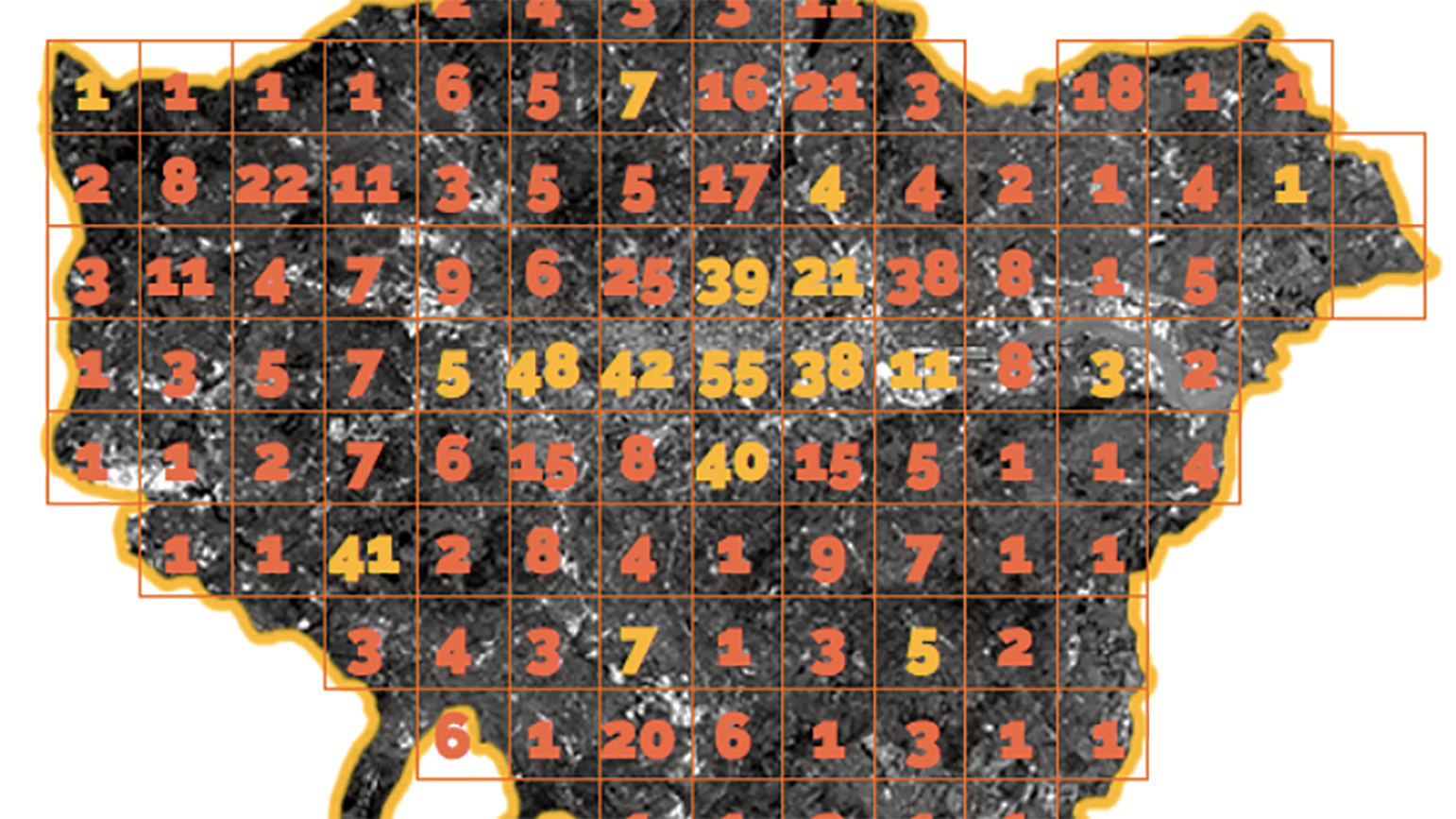
How to stop mass shootings? Maps speak louder than words.
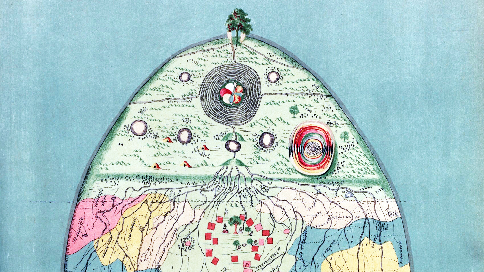
Without context, this is an alien world. How liberating!

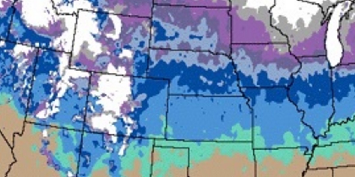
Contrary to public opinion, Kansas isn’t the flattest state in the Union — yet.
Compassion comes is five concentric zones, according to this cynical map.
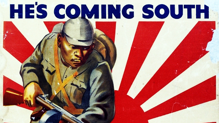
Fear of invasion is a recurring theme in Australian history.
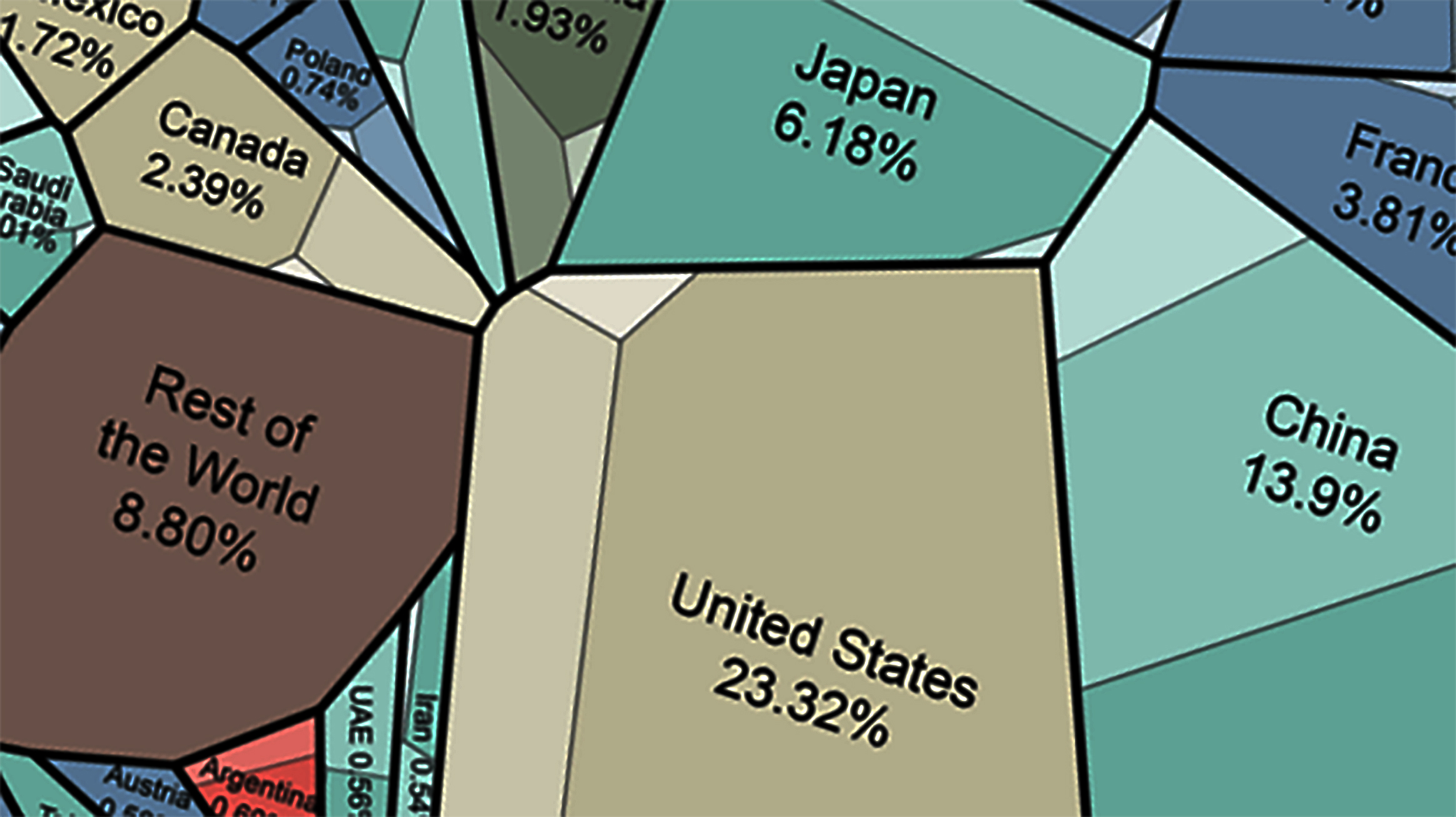
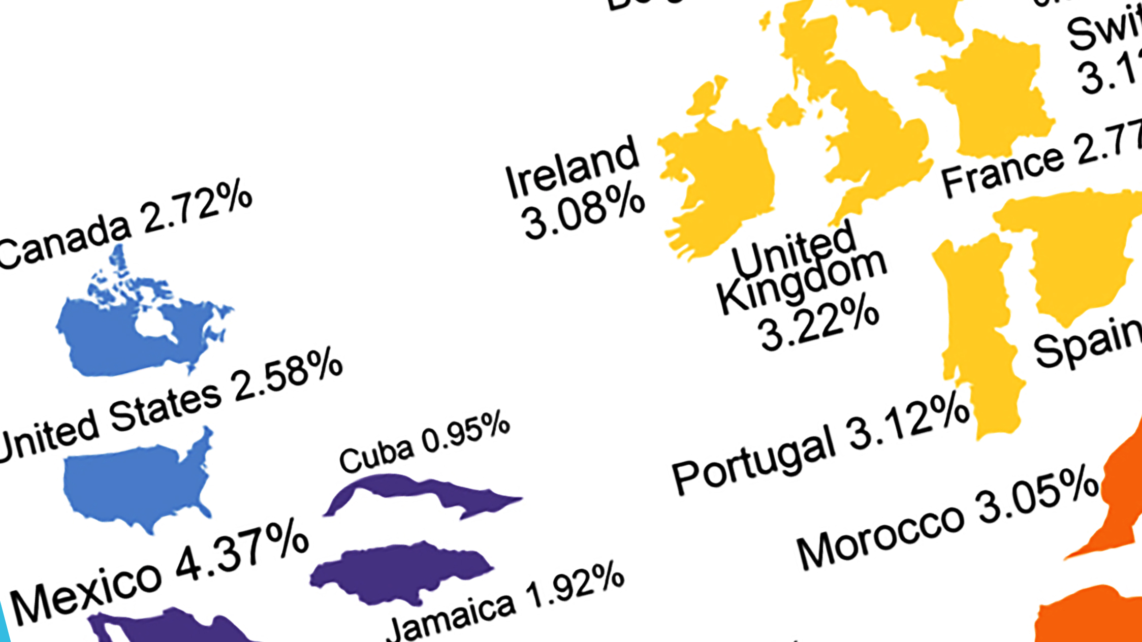
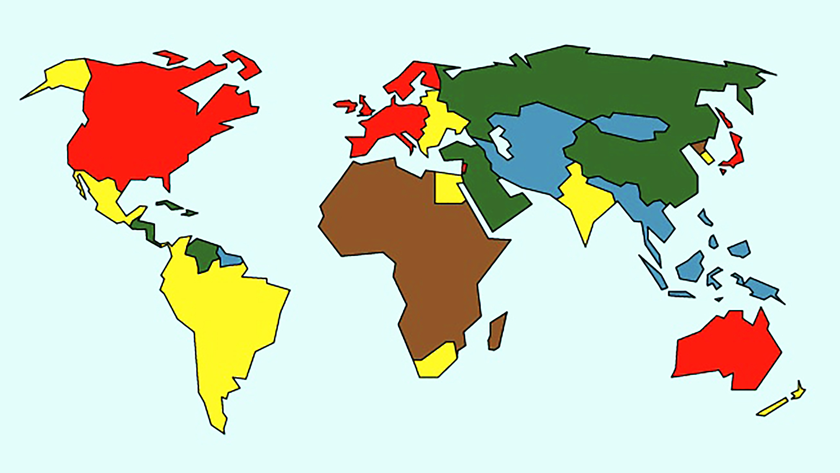
In 1960, the U.S. accounted for 40% of global economic output. This is where we’re at today.
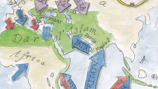
The conflict between East and West predates America and Islam, says a book full of cool maps
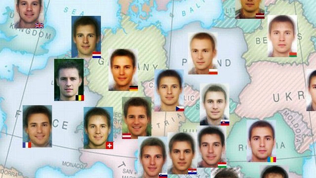
Do these facial composites merely represent national averages, or are they national “ideals”?