Africa wants its true size on the world map

- The African Union has joined a campaign to replace the Mercator map with the Equal Earth projection.
- The result would be a fairer representation of Africa’s relative size.
- It would not be the first such campaign to fail: Mercator may be 450 years old, but it has a digital trick up its sleeve.
On a world map in the Mercator projection, Russia appears larger than Africa. In fact, Africa (11.7 million sq mi, 30.4 million km2) is nearly twice as large as Russia (6.6 million sq mi, 17.1 million km2). Africa has finally had enough.
“(Mercator) is the world’s longest misinformation and disinformation campaign, and it just simply has to stop,” Moky Makura, executive director of advocacy group Africa No Filter, told Reuters. The group champions the introduction of the Equal Earth projection, which aims to give Africa its magnitudinal due.
Cartographical marginalization
The African Union (AU) — the association bringing together all of Africa’s 55 countries — has joined Correct the Map, a campaign that urges national governments and international organizations such as the UN or the World Bank to replace Mercator with Equal Earth.
According to AU Commission deputy chair Selma Malika Haddadi, the Mercator projection misrepresents Africa as “marginal,” while it is in fact the world’s second-largest continent in both area (after Asia but ahead of North America) and population (after Asia but ahead of Europe).
That marginalization has real-life consequences, Correct the Map argues. Africa’s smaller-than-actual cartographic footprint in the Mercator projection contributes to the global lack of attention for Africa. Some campaigners go even further, claiming not only that Mercator negatively affects how the world sees Africa, but also how Africans see themselves. The cartographically diminished size of their continent affects their identity and pride, they say.
Introducing the Equal Earth projection as the standard map across all of Africa’s classrooms is their solution to “reclaim Africa’s rightful place on the global stage.”
“Maps are not neutral,” Fara Ndiaye, the co-founder of Speak Up Africa, told The Washington Post. “They were never meant to be. They shape how we learn, how we imagine power, how we see ourselves.”
It’s fair to say the Dead White Male at the center of this controversy would have been baffled by the controversy. His aim was not to antagonize Africans, but to aid sailors.
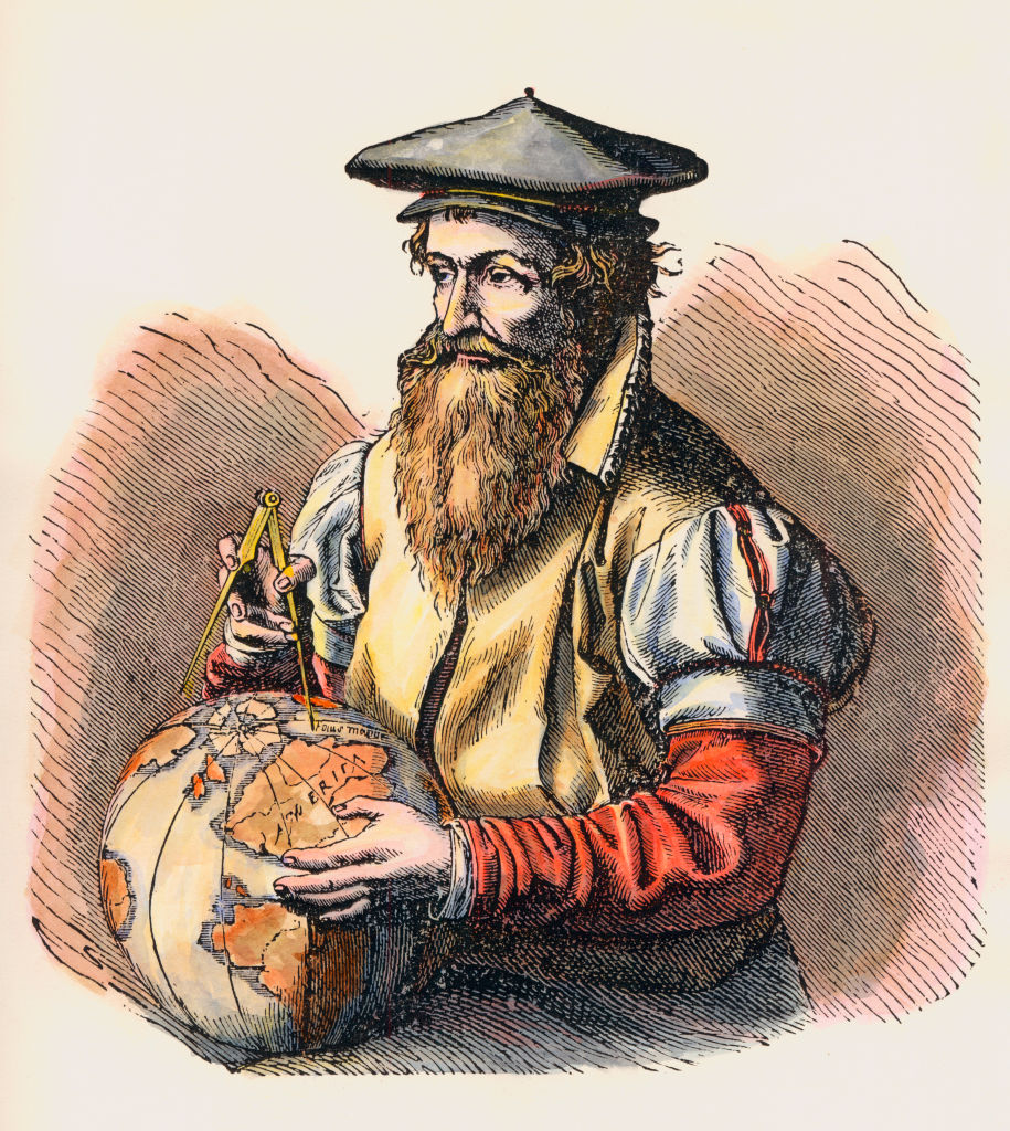
In 1569, Flemish mapmaker Geert De Cremer — known by his Latinized name as Gerardus Mercator — introduced a map projection that revolutionized navigation. Simply put: a straight line on a Mercator map is a straight line at sea.
The U.S. appears four times larger than it actually is
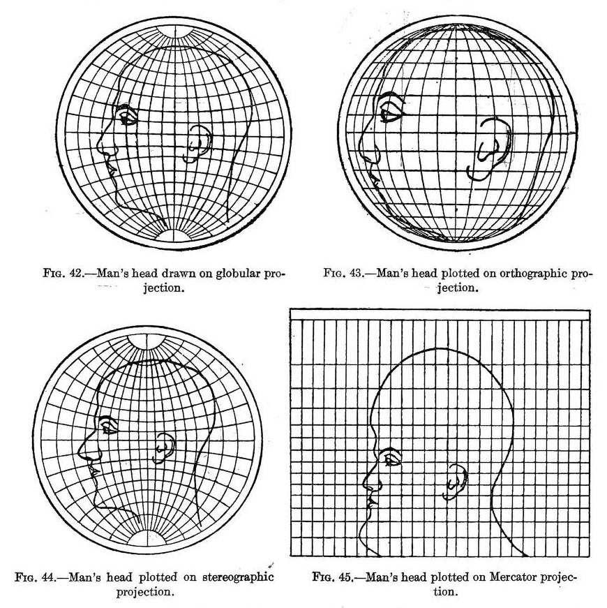
That’s not as obvious as it might seem. If you flatten a three-dimensional object, such as the Earth, onto a two-dimensional surface, like a map, you’ll inevitably create some distortion.
Mercator’s radical solution was to reduce directional distortion to zero: His projection maintains accurate angles and directions. That so-called conformal map projection made life (a little bit) easier for the ships swarming out all over the world in the Age of Sail.
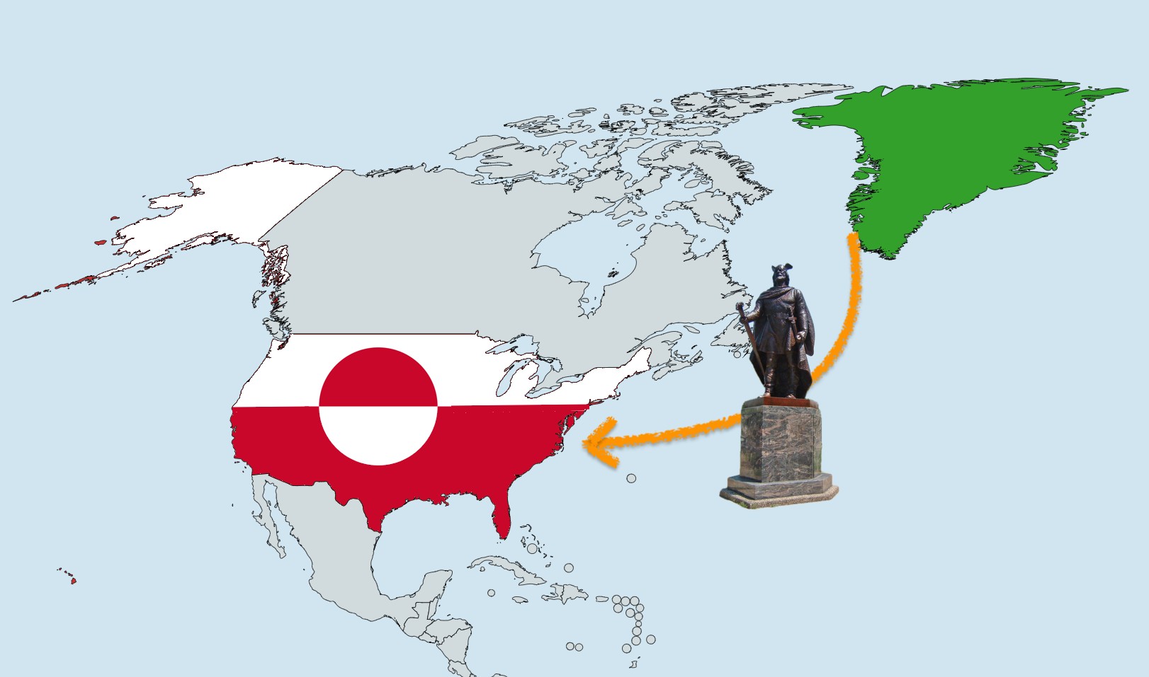
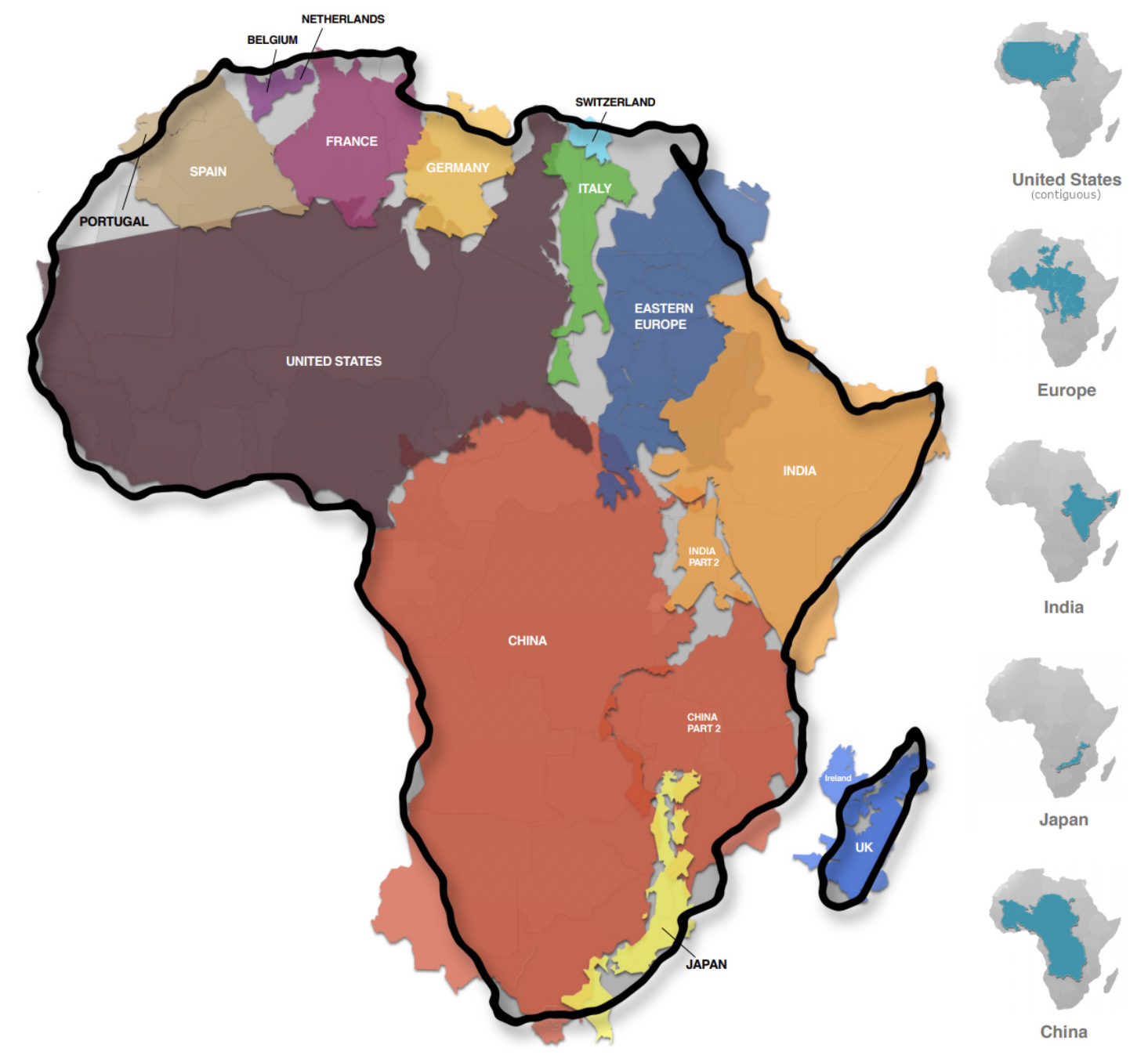
But that decision came with a trade-off: It grossly inflated the size of land masses closer to the poles. The classic example is Greenland, which looks about as big as Africa on a Mercator map, while in reality Africa is about 14 times larger. Mercator also works in favor of territories a bit farther south: the U.S. appears four times larger than it actually is; the UK appears three times larger.
While it may not have been Mercator’s intention, that distortion helped amplify the narrative of European (and by extension North American and Russian) dominance over subject peoples living closer to the Equator. Doing away with Mercator would thus help to “decolonize” the map.
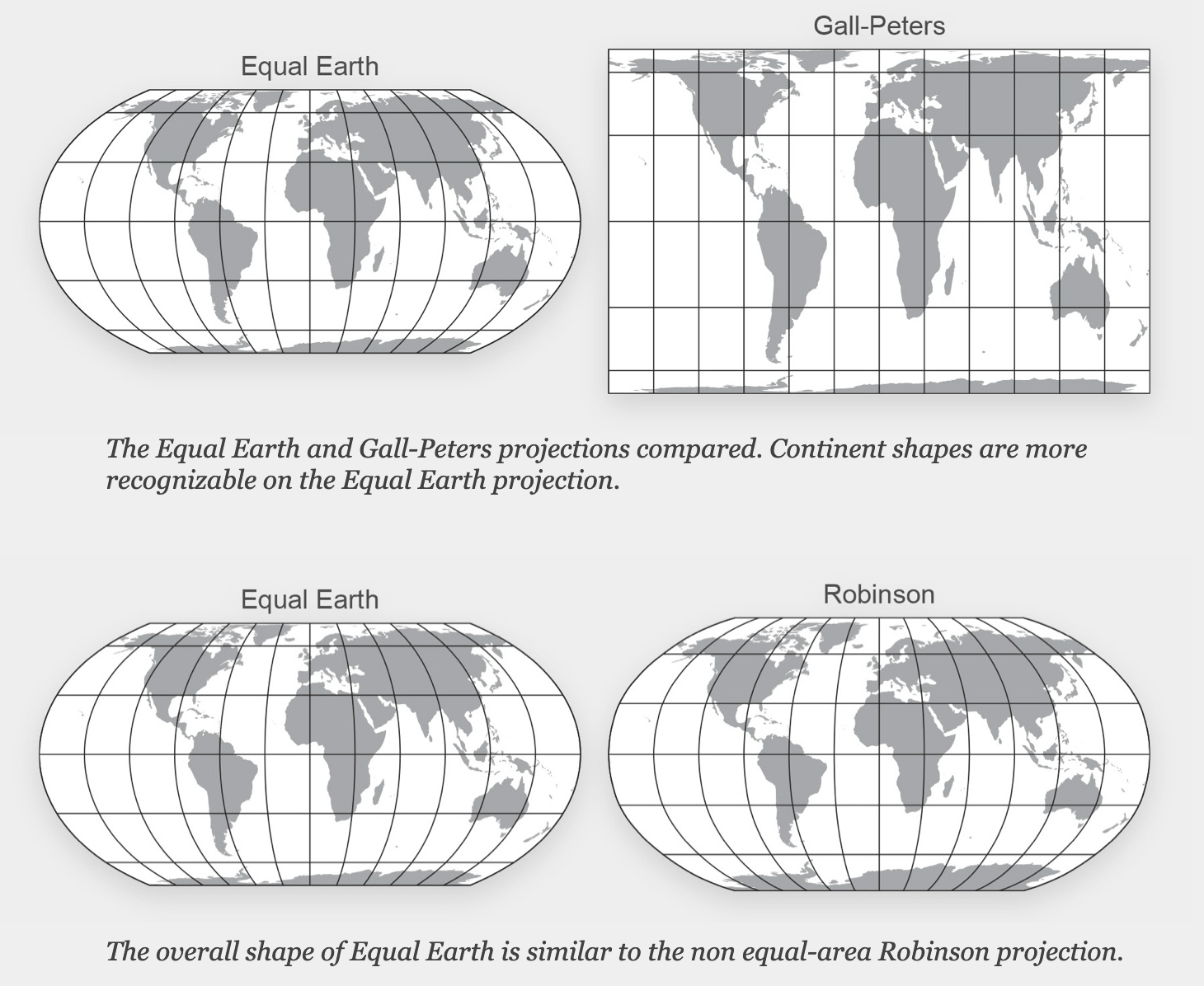
The disconcertingly droopy look of the Gall-Peters projection
This comes at the inevitable expense of some of the shape of the Earth’s land masses, but mapmakers have taken great pains to maintain as much as possible of the map’s “traditional” appearance. So, on one hand, Greenland no longer looks like it could eat Madagascar for breakfast. On the other hand, however, Africa and the other land masses don’t have the disconcertingly droopy look they have in the Gall-Peters projection, which represents accurate land area sizes relative to one another, but at the cost of distorting their shapes.
The AU’s endorsement undoubtedly adds geopolitical heft to the campaign for cartographic change. So, is this the inflection point that changes our standard world map — and consequently also how we see the world?
Perhaps not. For one, traditions are hard to break. Case in point: The AU itself is still using Mercator for some of the maps on its websites. But secondly, and most importantly, maps aren’t about fairness; they’re about function. Despite its advanced age, the Mercator projection has an in-built advantage over most others.
Mercator’s rectangular grid wasn’t just instrumental for 19th-century whaling vessels tracking their prey; it’s just as useful for 21st-century digital cartography. All those straight angles make Mercator the projection of choice for zoomable maps.
So Mercator isn’t obsolete. Nor does the projection somehow obscure the true size of Africa. As a continent that’s bisected by the Equator, Africa is actually the least distorted of all in the Mercator projection. There are plenty of maps and map tools around to demonstrate how many of those other inflated land masses actually fit into Africa.
No map projection is perfect — each has its use
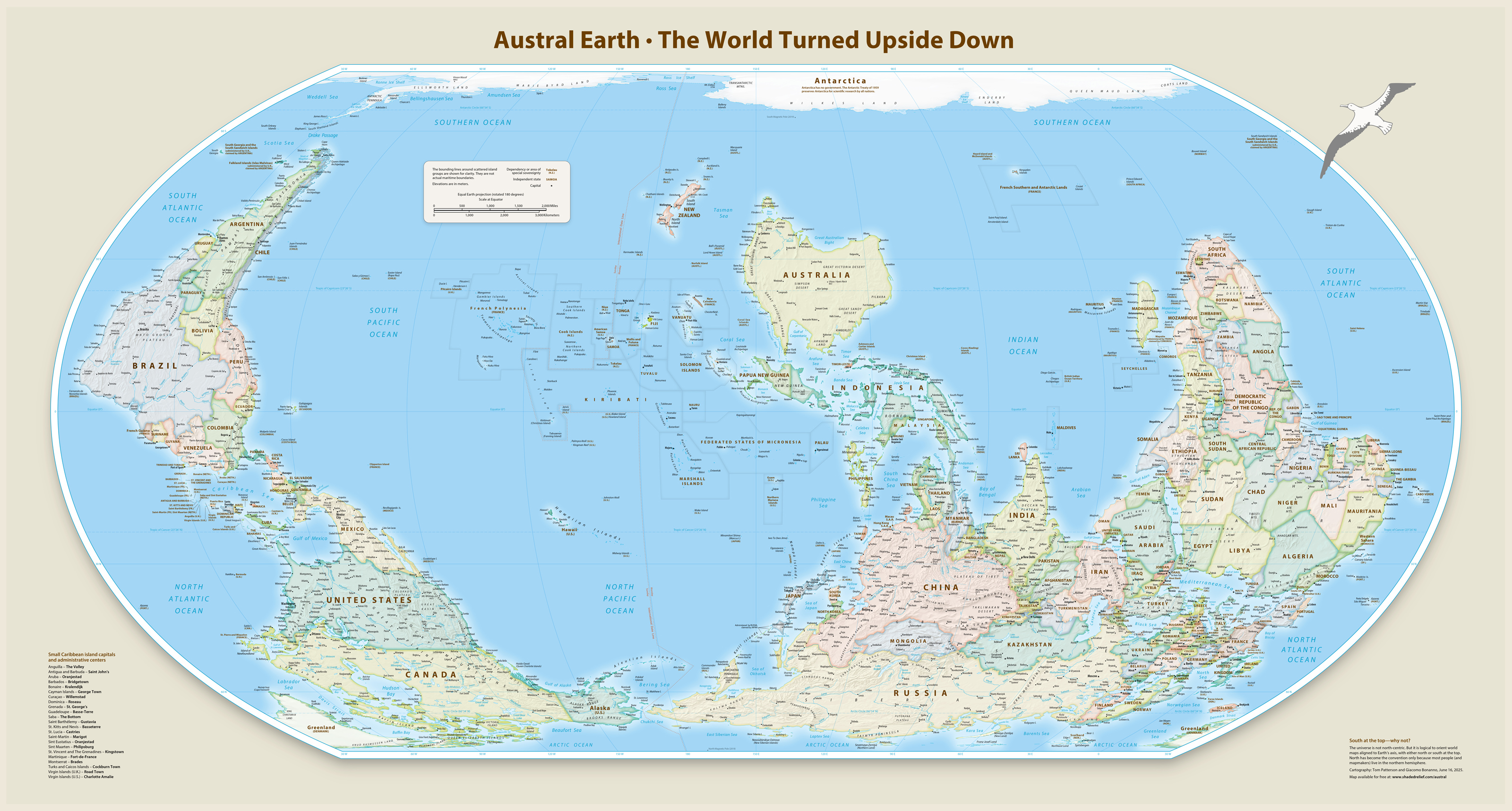
Does that mean the Equal Earth projection has no point? Far from it: All map projections make a point — but all do so at the expense of other points.
The key to Equal Earth’s unique selling proposition is in its name: It provides an equal-area representation of the world, accurately preserving the relative sizes of land masses while maintaining aesthetically pleasing and recognizable shapes. From an African perspective, it provides a welcome and overdue recalibration of the world map. And for thematic maps where size accuracy is critical, it is an excellent choice.
But by prioritizing equal area, the projection gives up on directional fidelity. Rhumb lines (those straight lines on Mercator maps) go bendy by up to 40 degrees on Equal Earth maps, which means Mercator remains the preferred choice for navigation, both of the sailing and zooming varieties.
How we see the world is a matter of perspective and projection — precisely because no map projection is perfect.
Strange Maps #1279
Got a strange map? Let me know at strangemaps@gmail.com.
Follow Strange Maps on X and Facebook.