Strange Maps
A special series by Frank Jacobs.
Frank has been writing about strange maps since 2006, published a book on the subject in 2009 and joined Big Think in 2010. Readers send in new material daily, and he keeps bumping in to cartography that is delightfully obscure, amazingly beautiful, shockingly partisan, and more. "Each map tells a story, but the stories told by your standard atlas for school or reference are limited and literal: they show only the most practical side of the world, its geography and its political divisions. Strange Maps aims to collect and comment on maps that do everything but that - maps that show the world from a different angle."
featured


All Stories
She met mere mortals with and without the Vatican’s approval.
TheTrueSize.com offers hours of fun while you stretch and shrink countries and states all over the globe.
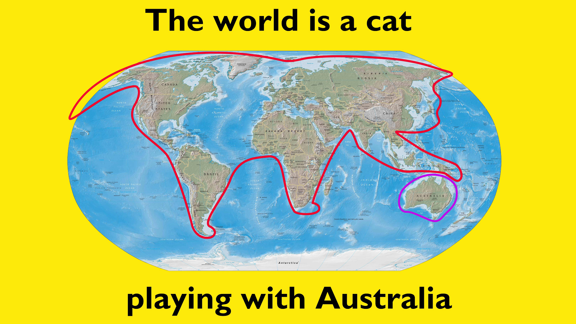
Despite itself, this collection of awful cartography may just make a few useful observations.
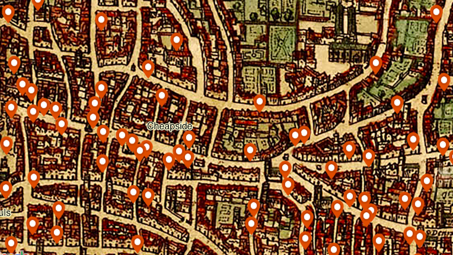
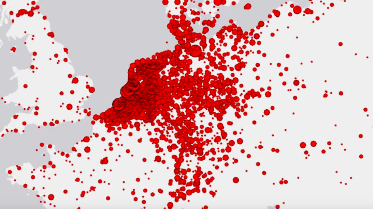
Interactive map reveals the horror — and the patterns — of murder in 14th-century London.

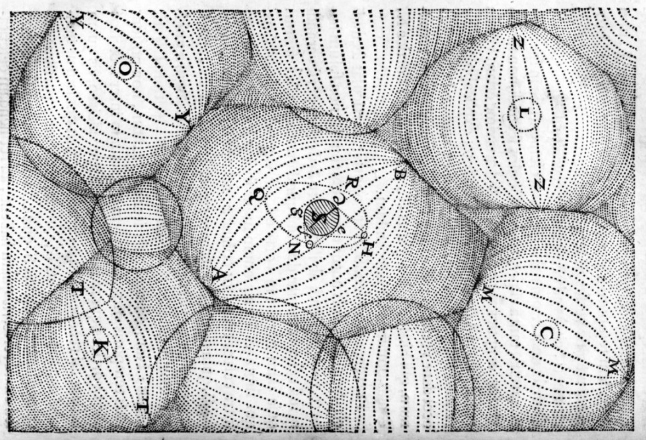
As this typewritten map shows, constraints can be freeing.

No, the Syrian civil war is not over. But it might be soon. Time for a recap.
▸
with
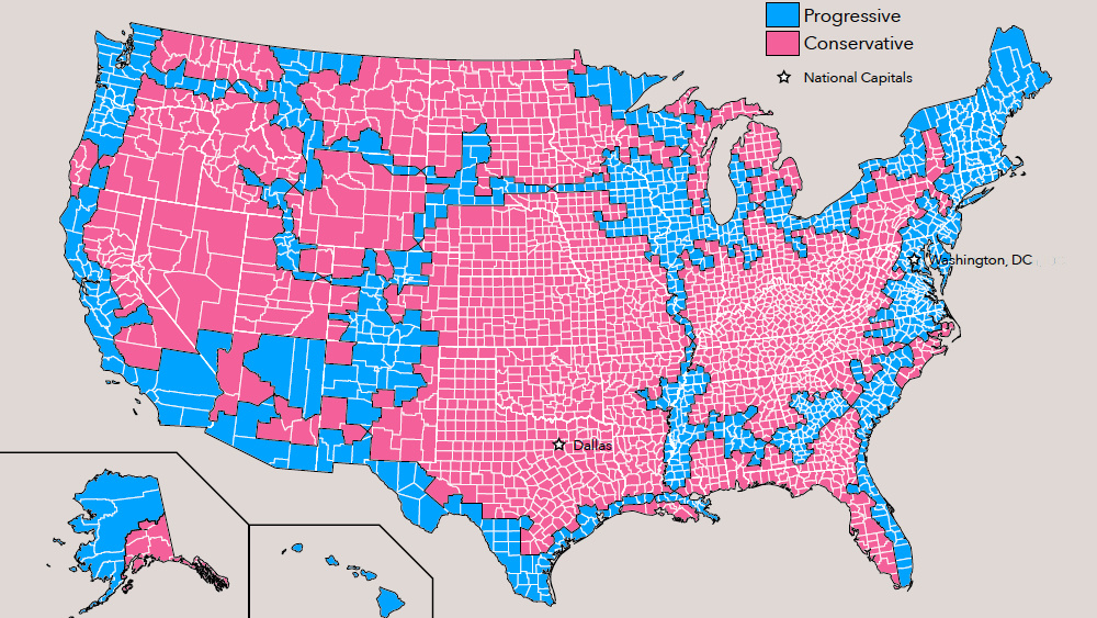
Progressive America would be half as big, but twice as populated as its conservative twin.
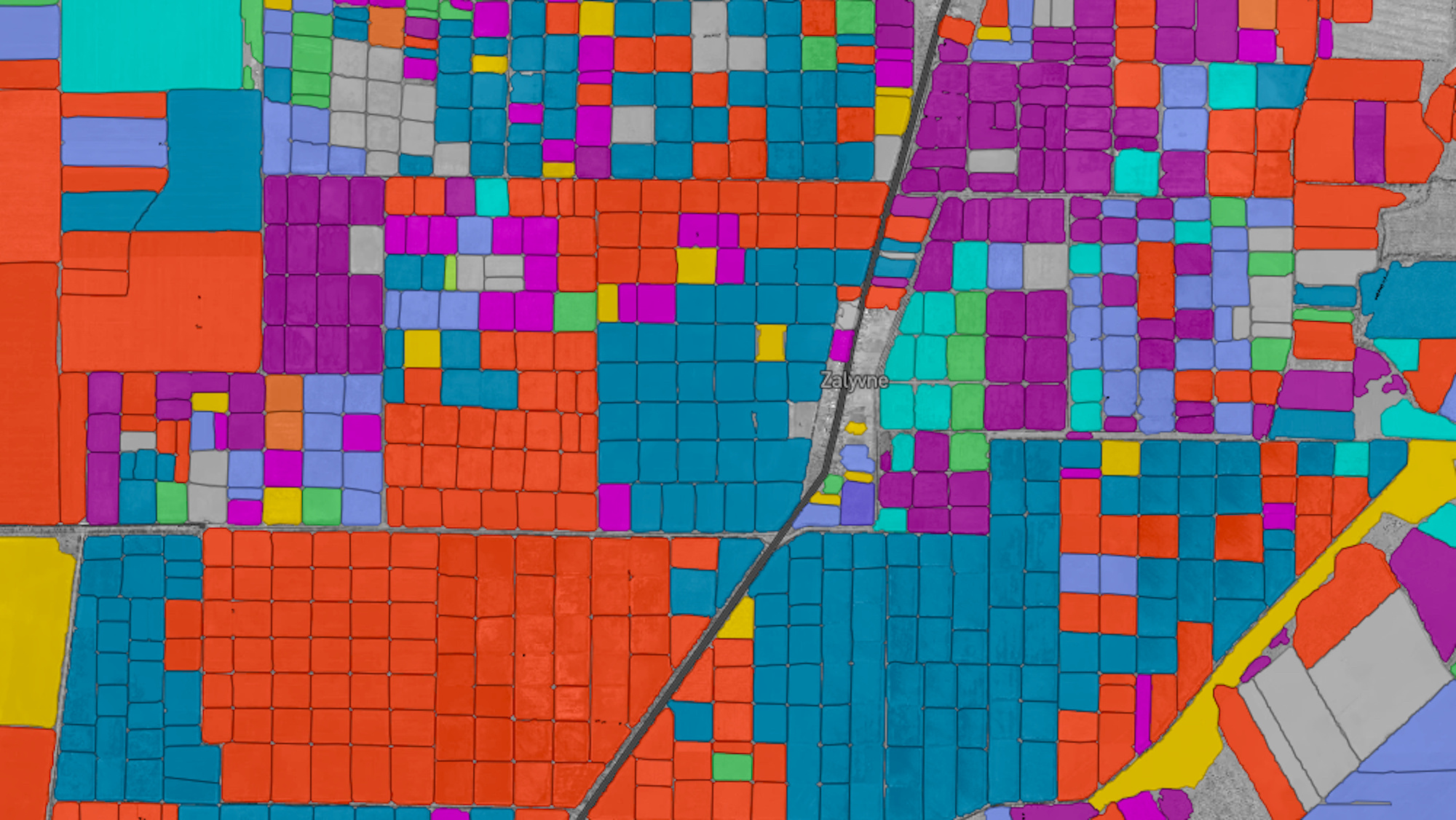
Detailed (and beautiful) information on 57 million crop fields across the U.S. and Europe are now available online.
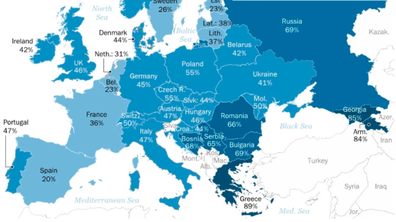
Meanwhile, Spaniards are the least likely to say their culture is superior to others.
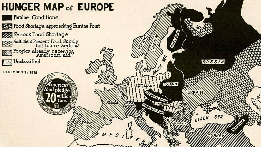
This 100-year-old map, originally made for American consumption, highlights the famines that swept across Europe after WWI.
The greatest danger to our planet is not pollution or climate change, but our own despair.
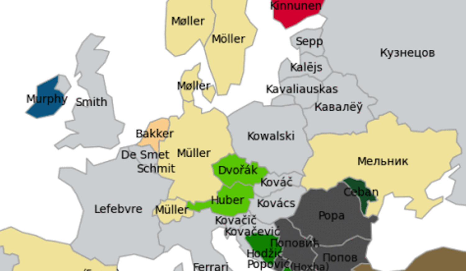
In more than a dozen countries as far apart as Portugal and Russia, ‘Smith’ is the most popular occupational surname
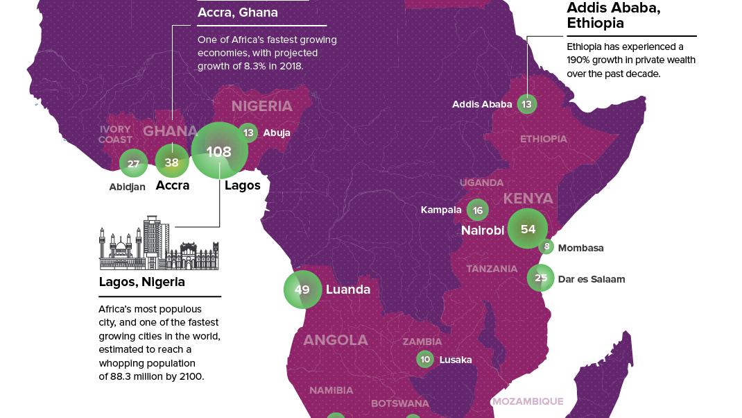
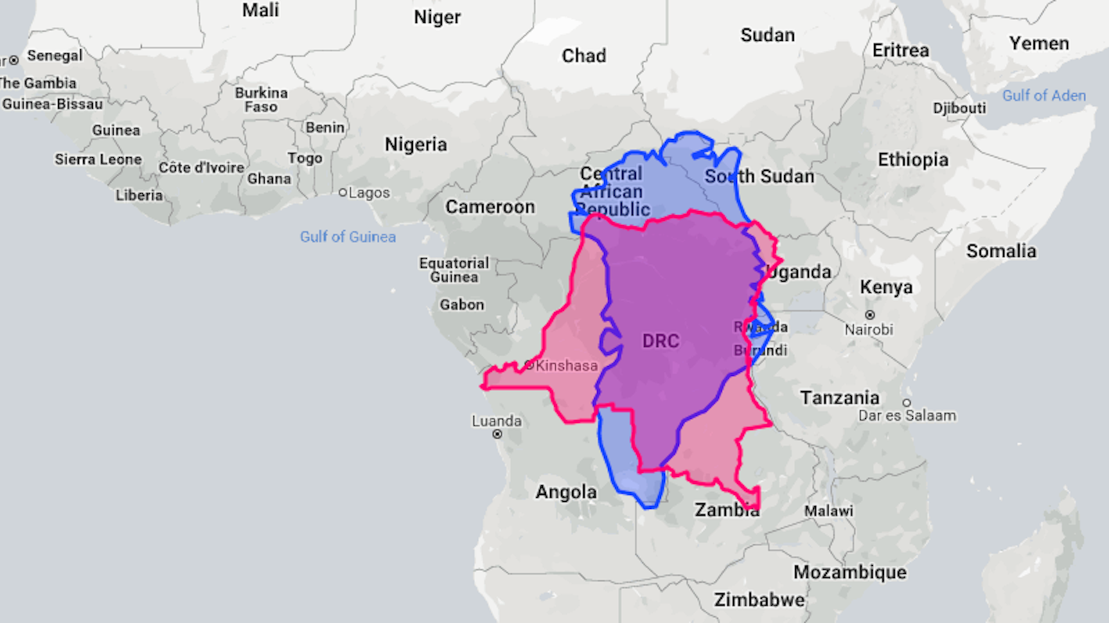
South Africa is no longer the only place on the continent that has urban wealth clusters
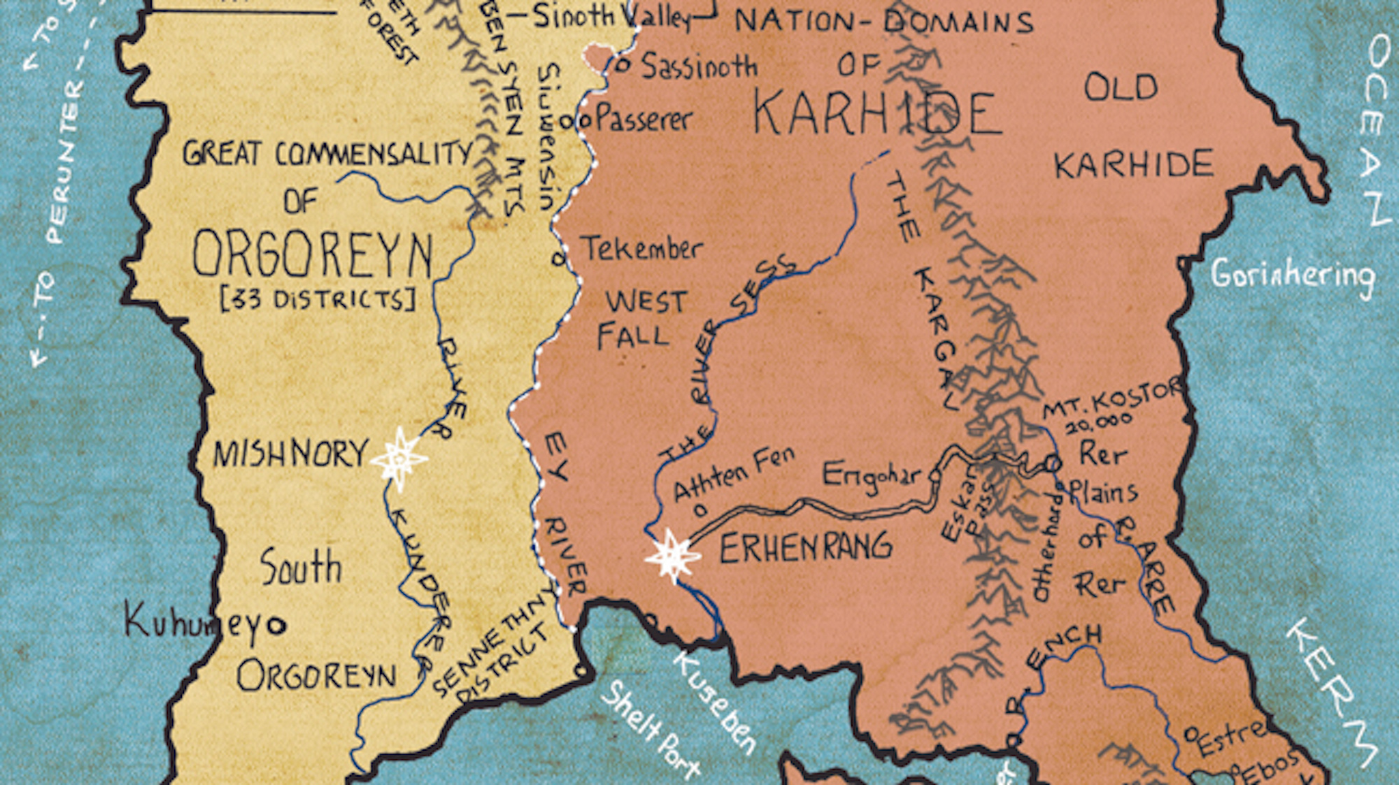
Like Stevenson, Tolkien and other creators of fantasy worlds, Ursula K. Le Guin was a cartographer as well as a writer
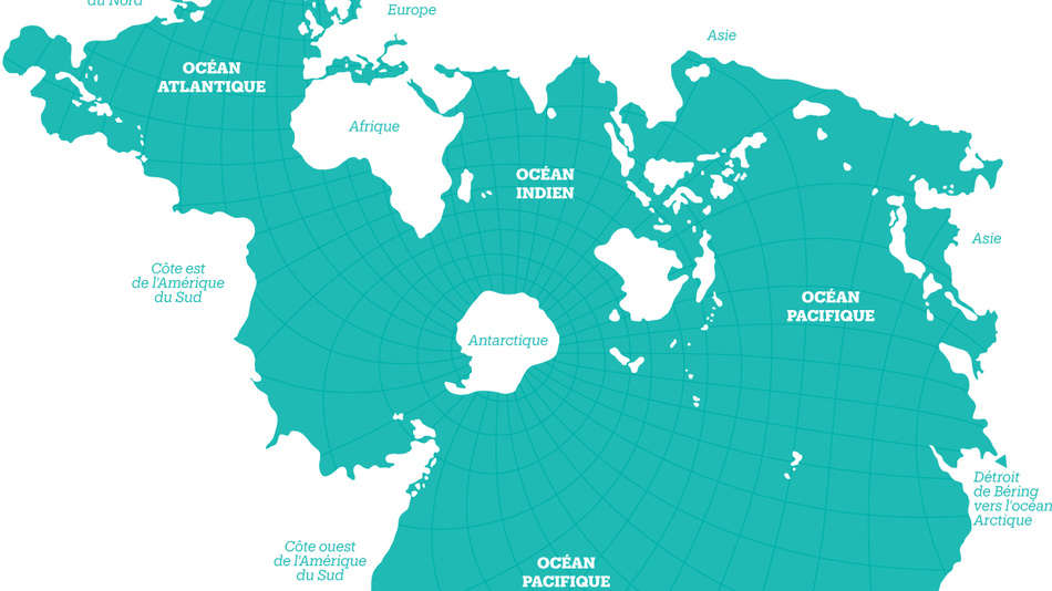
The Spilhaus Projection may be more than 75 years old, but it has never been more relevant than today.
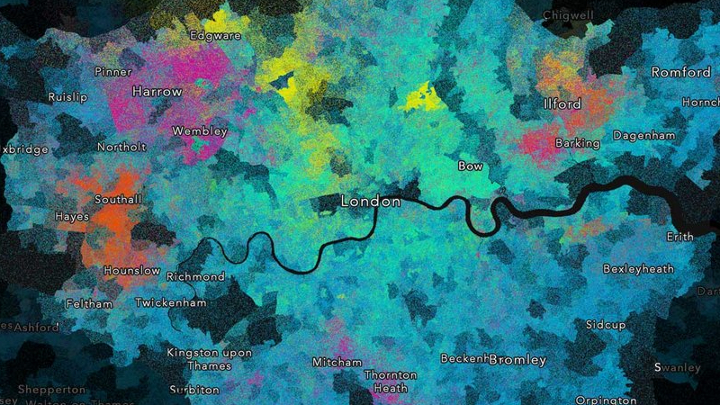
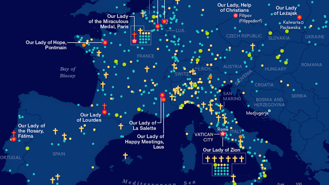
Although London is predominantly Christian, this map shows an archipelago of different faiths throughout the city.
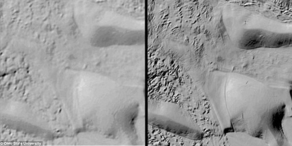
Not so long ago, we had better maps of Mars than of Antarctica. Now, Antarctica is the best-mapped continent in the world.
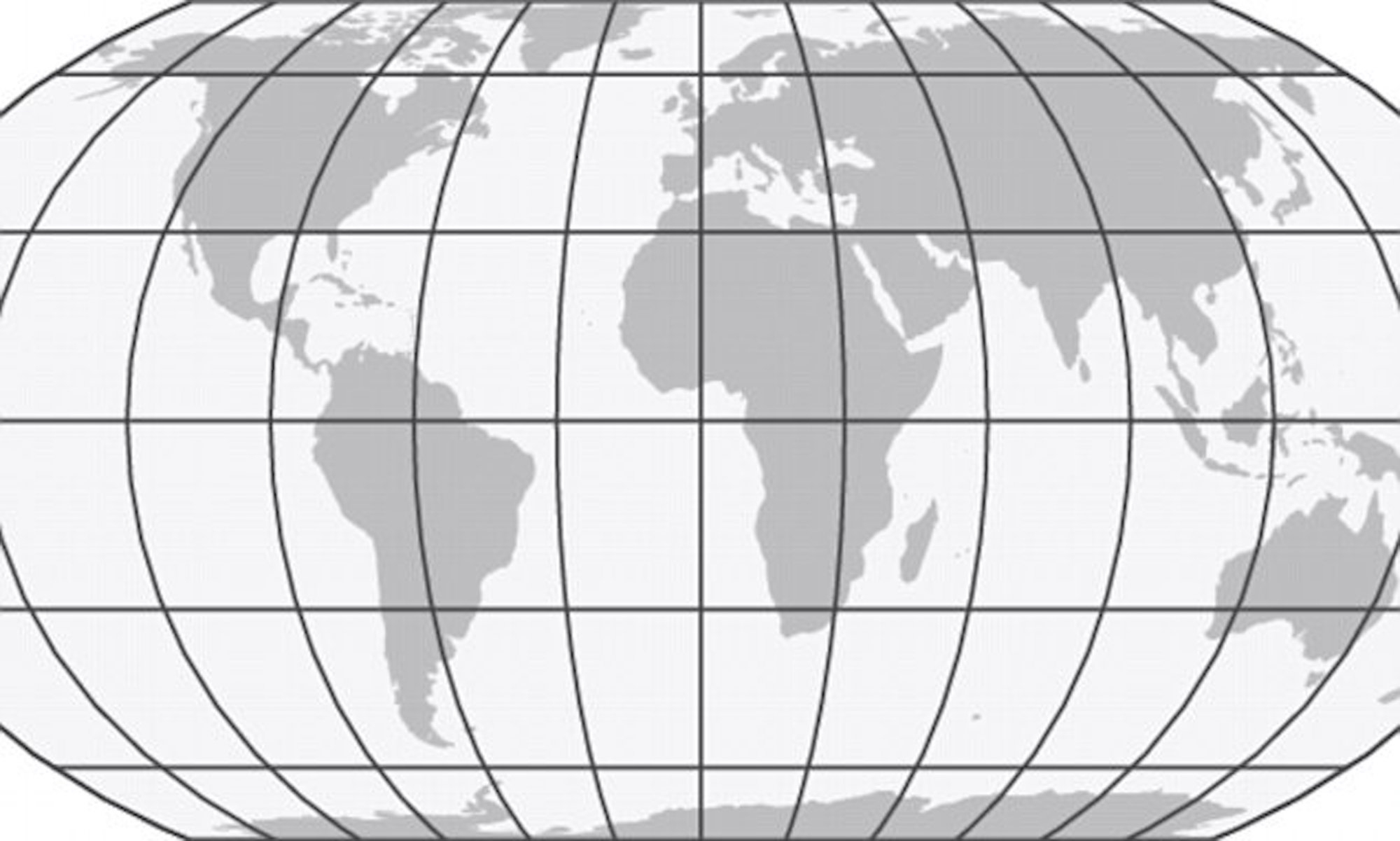
Three scientists have produced a map of the world which accurately reflects the size of all the continents. They’re calling the Equal Earth Projection.
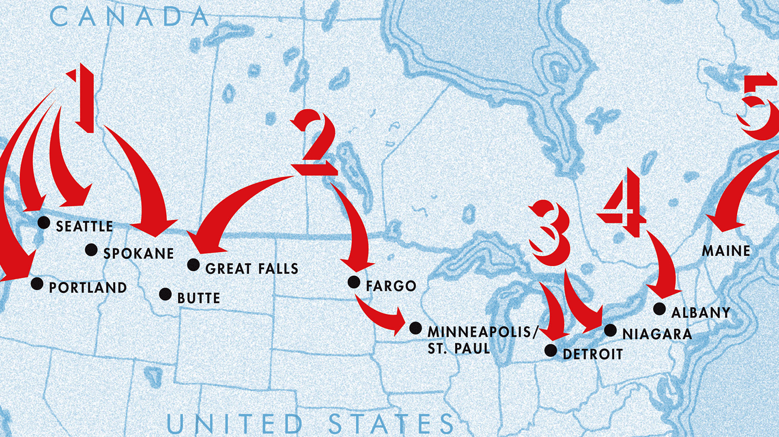
America’s fear of an Anglo-Japanese alliance led Canada to worry about a U.S. attack—and in the end, devise a scheme for a ‘pre-emptive invasion’ of its southern neighbor.
By the late 18th century, up to 70% of the soldiers manning the ships of the Dutch East India Company came from outside the Netherlands
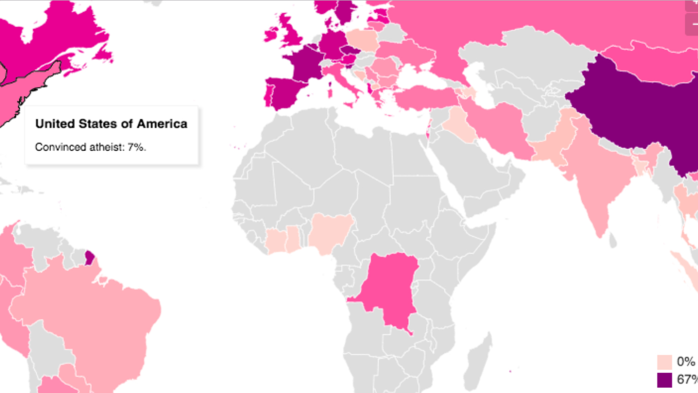
Faith is in retreat, atheism is on the march. But only in China does a majority positively state they don’t believe in God.
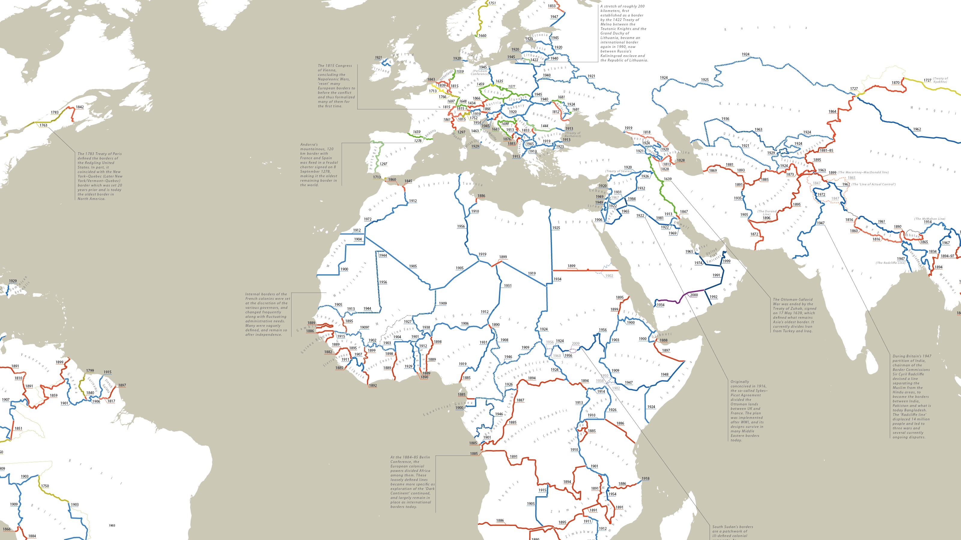
No international borders, no international order—and yet, most land borders are not very old: more than half were drawn after 1900.
These maps offer a glimpse of what’s been lost – or rather, destroyed – by previous generations.
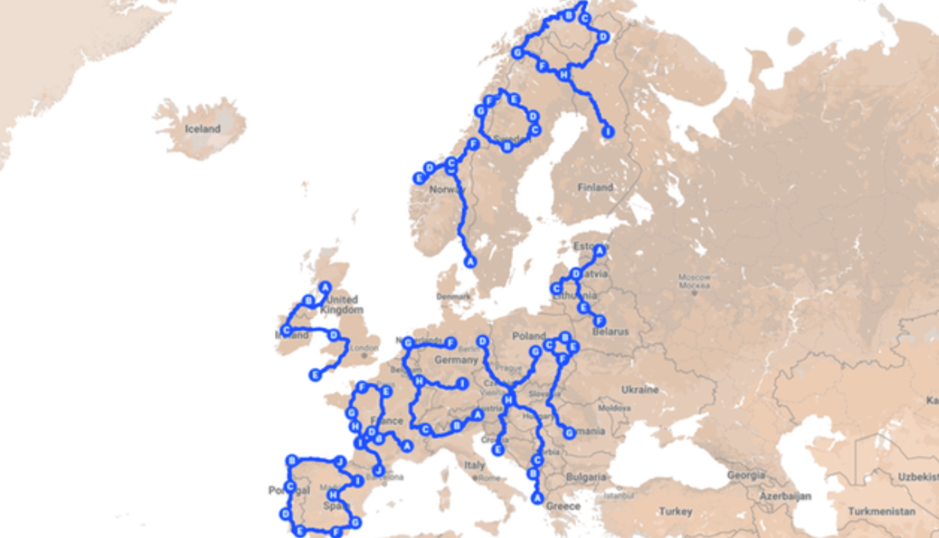
Englishman Andy Pardy is traveling 18,000 miles (30,000 km) across Europe this summer to make a continent-sized political statement
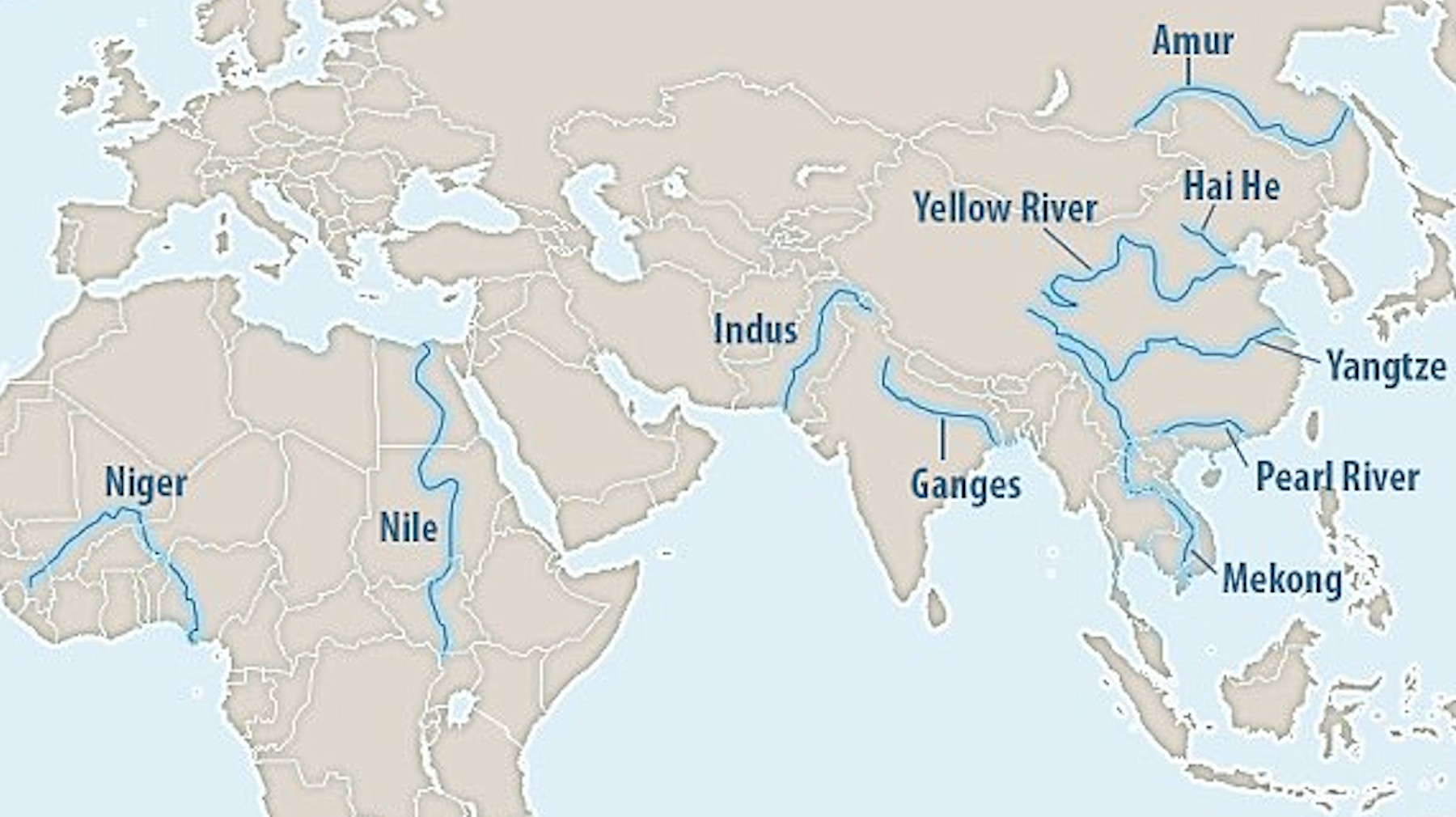
Just ten rivers are responsible for up to 95% of all river-borne plastic trash that ends up in the sea. Silver lining: cleaning them up would have a huge positive impact.
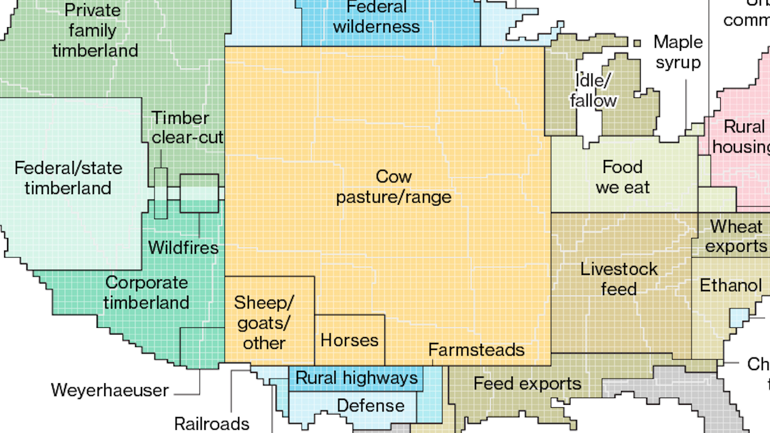
America’s corn syrup fields are big enough to cover all its airports and railroads, and other surprising lessons from a ‘tidied-up’ map of America’s land use zones
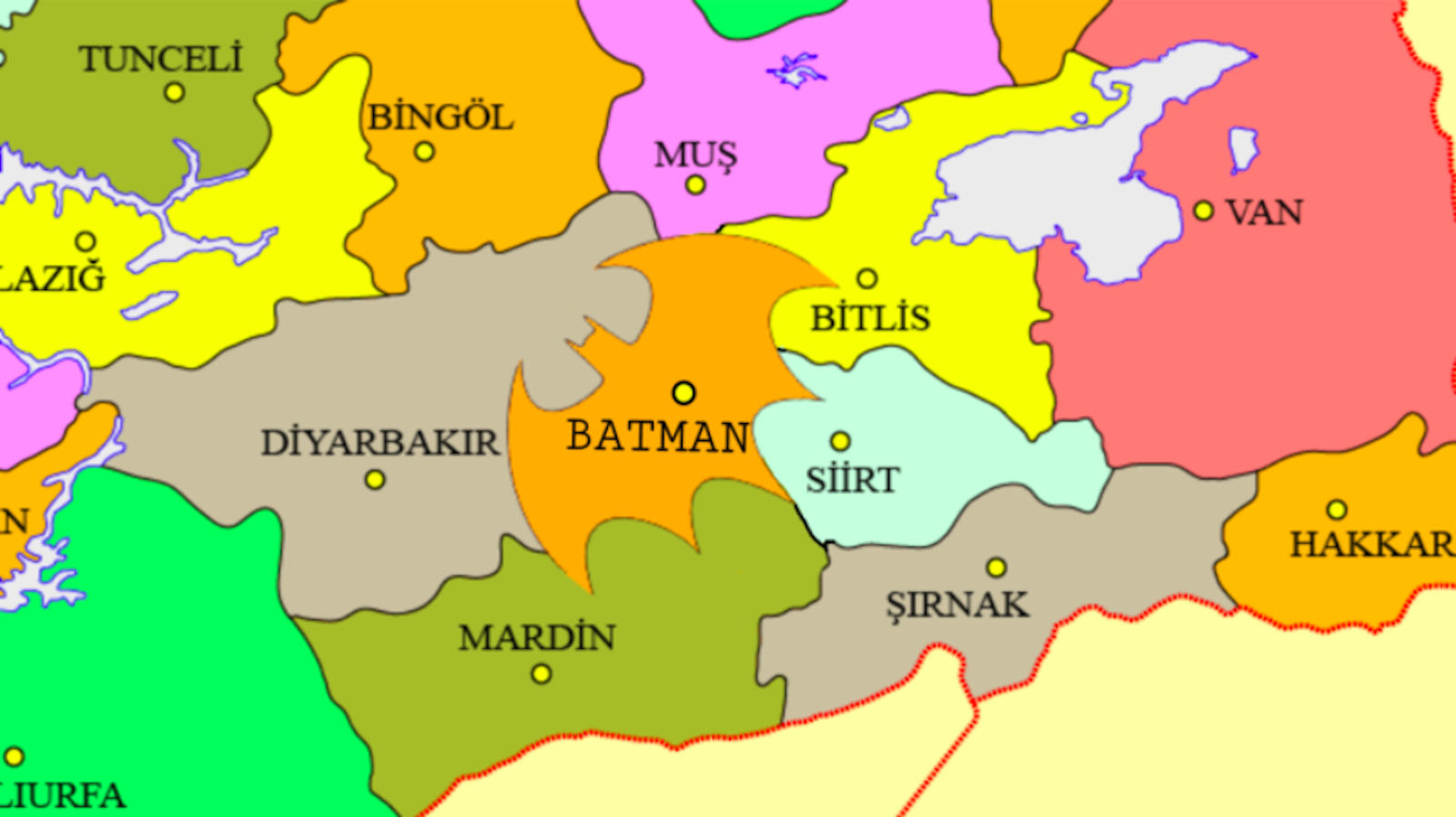
More than 20,000 people have signed a petition for Batman, one of Turkey’s 81 provinces, to be re-shaped so its borders resemble the Bat-Signal.

Mind-boggling as it is, some of the world’s roundest countries are also some of the most rectangular ones.
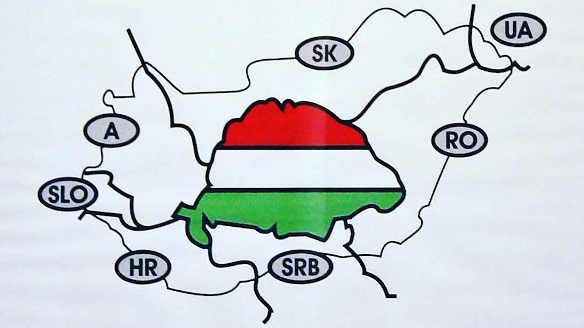
Hungary’s Two-Tailed Dog Party campaigns on an ‘anti-anti-immigration platform, with slogans such as: “Sorry about our Prime Minister”, and “Feel free to come to Hungary, we already work in England anyway!”
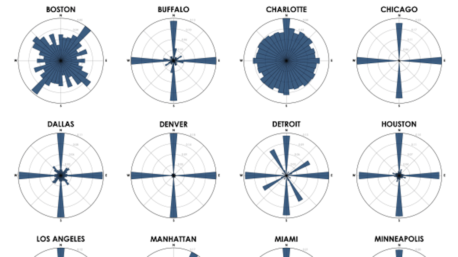
Simple diagrams reflect straightforward grids that make navigation easy. Complex diagrams equal ‘messy’ street grids, making it harder to find your way.