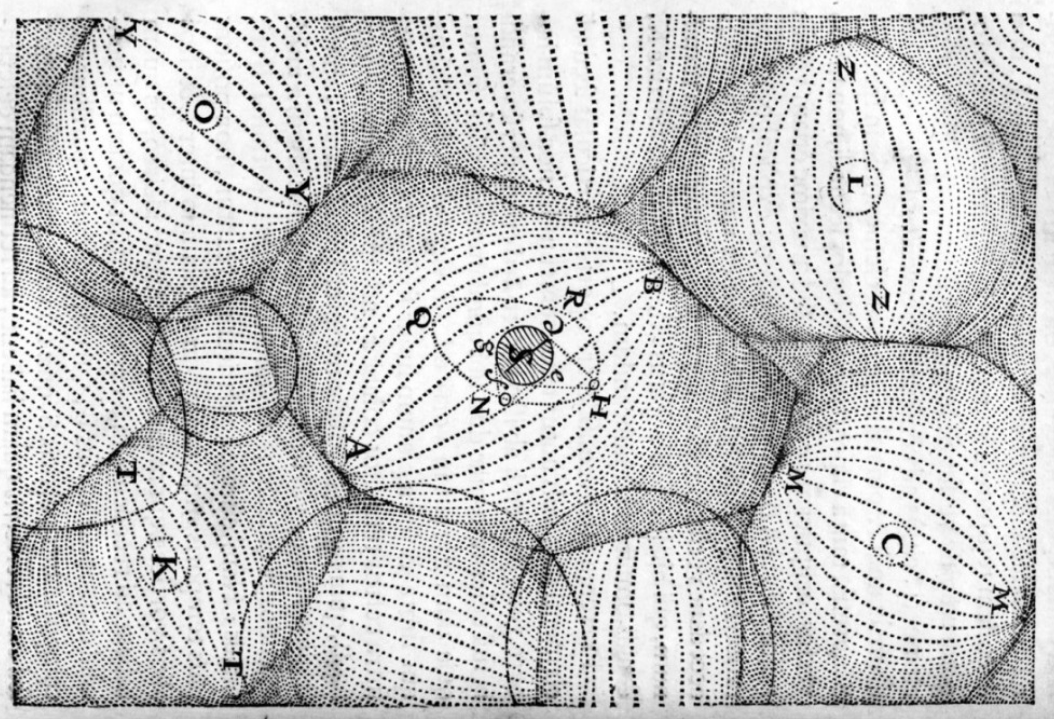
Strange Maps
A special series by Frank Jacobs.
Frank has been writing about strange maps since 2006, published a book on the subject in 2009 and joined Big Think in 2010. Readers send in new material daily, and he keeps bumping in to cartography that is delightfully obscure, amazingly beautiful, shockingly partisan, and more. "Each map tells a story, but the stories told by your standard atlas for school or reference are limited and literal: they show only the most practical side of the world, its geography and its political divisions. Strange Maps aims to collect and comment on maps that do everything but that - maps that show the world from a different angle."
featured


All Stories
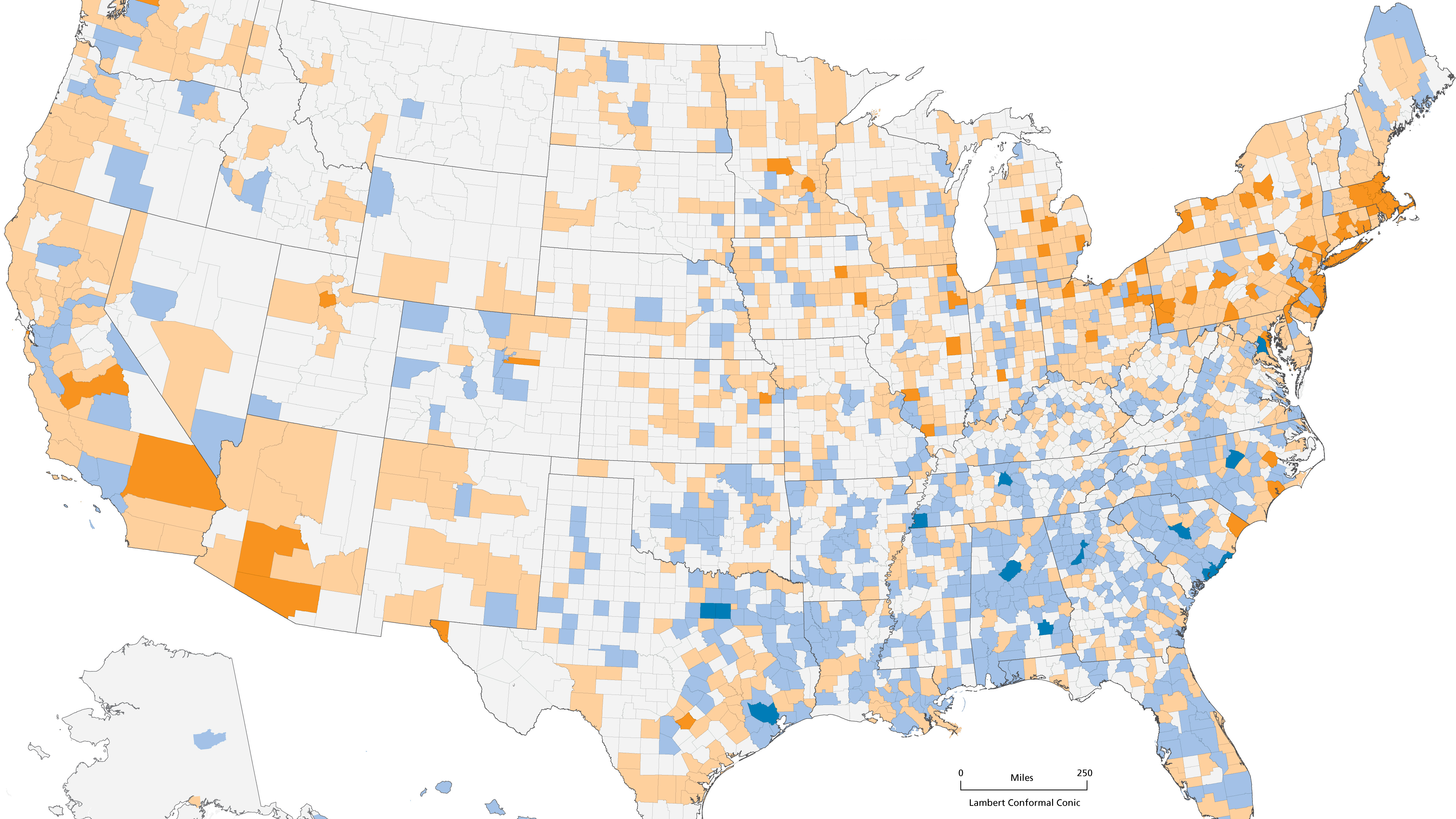
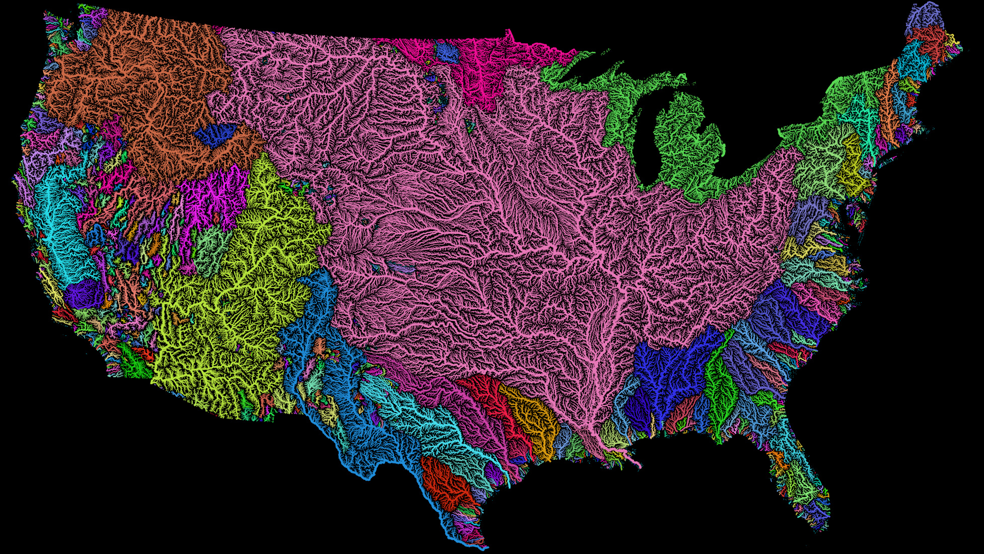
How deep are America’s cultural fault lines? Depends on which data you crunch.
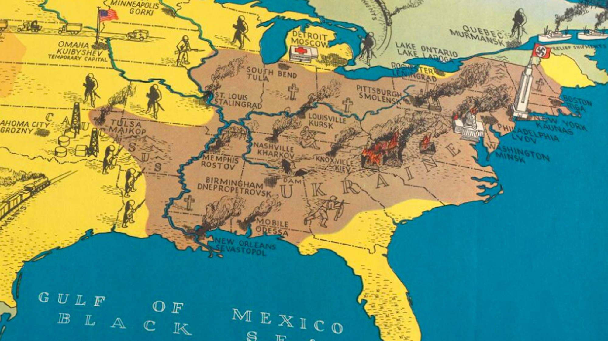
By transplanting Operation Barbarossa on a map of the US, it showed the devastating effects of the Nazi invasion
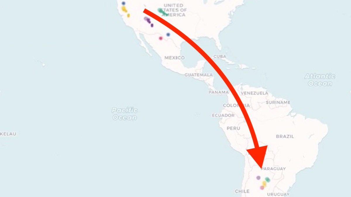
UNHCR data shows a small but intriguing flow of refugees from countries like France, Germany and the UK
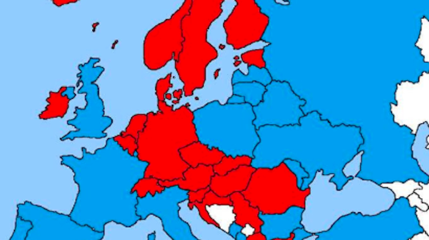
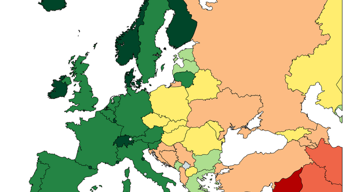
It shows Europe divided into two bafflingly unfamiliar blocs – what do red and blue stand for?

The Glen McLaughlin Collection brings together more than 700 historical examples of ‘California as an island’.
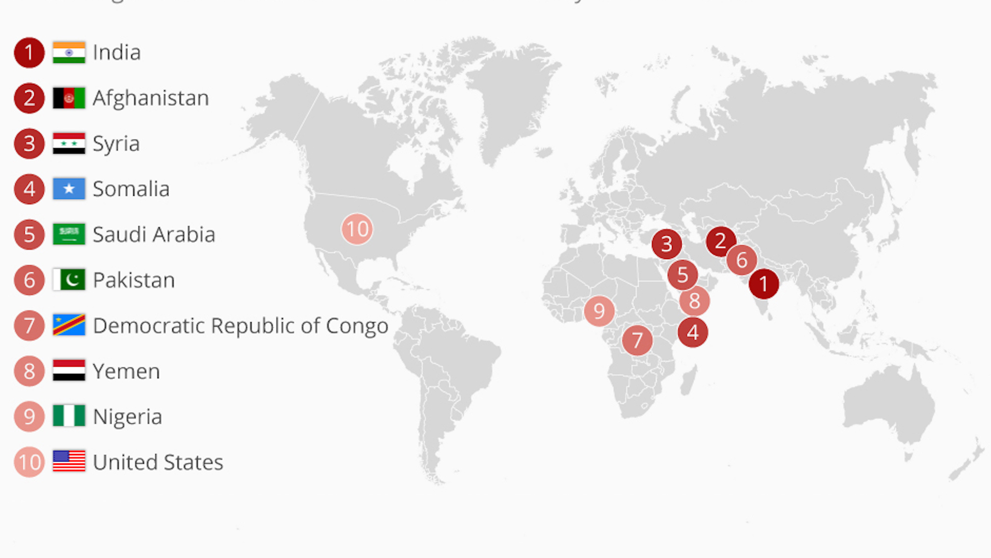
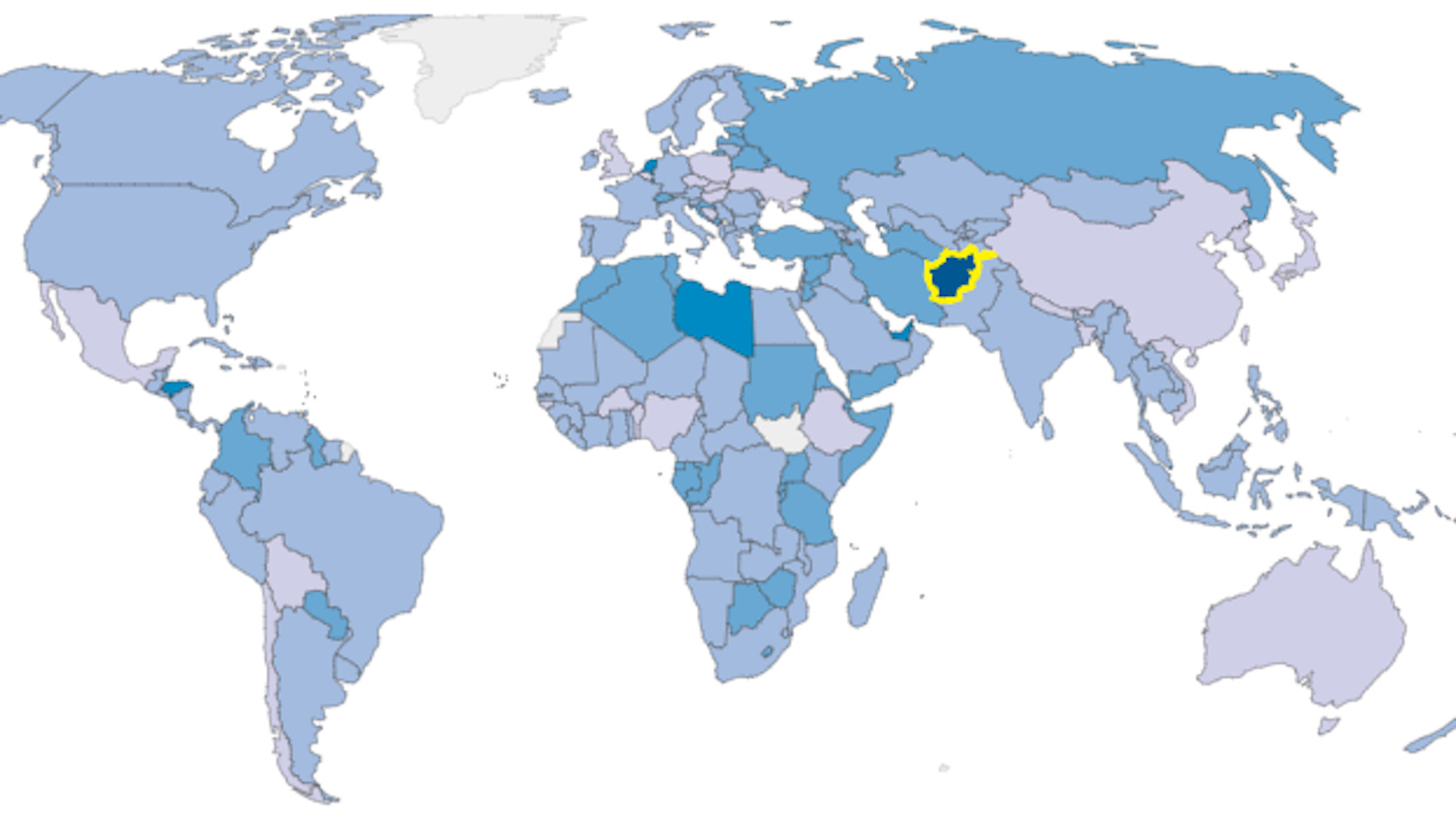
#MeToo and #TimesUp catapult America into the club of world’s most anti-women countries.
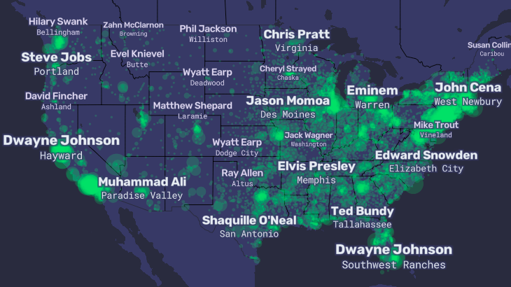
The ‘People Map of the United States’ zooms in on America’s obsession with celebrity
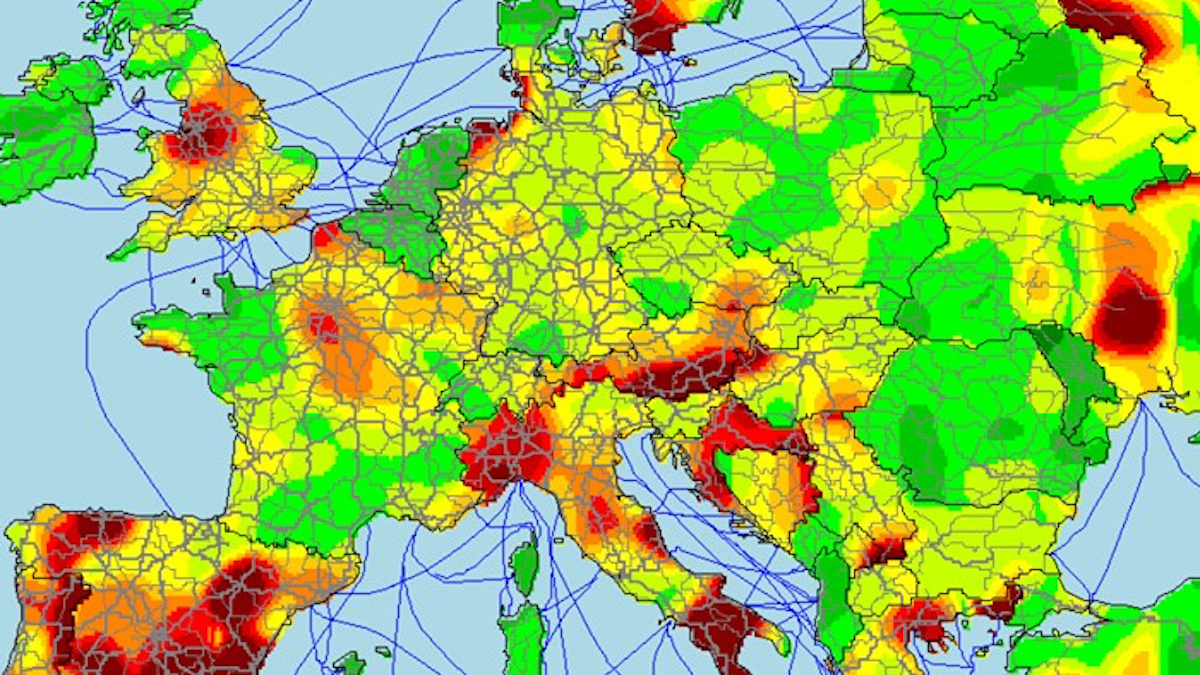
Average waiting time for hitchhikers in Ireland: Less than 30 minutes. In southern Spain: More than 90 minutes.
Notre Dame was almost torched in 1871, when Communards set Paris’ major buildings ablaze.

As Game of Thrones ends, a revealing resolution to its perplexing geography.
Controversial map names CEOs of 100 companies producing 71 percent of the world’s greenhouse gas emissions.
This culinary map of Los Angeles proves the city is more than just the world’s movie capital.
No, depression is not just a type of “affluenza” — poor people in conflict zones are more likely candidates
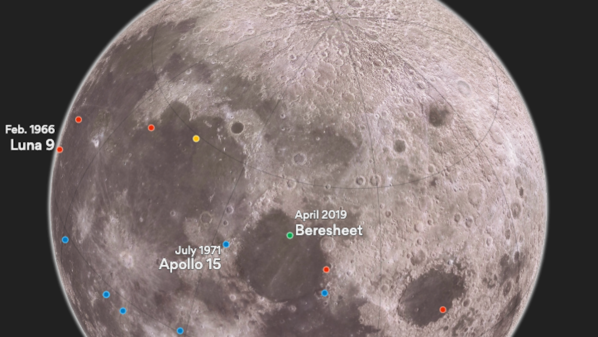
“Beresheet” is first privately-funded space ship ever to make a lunar touchdown
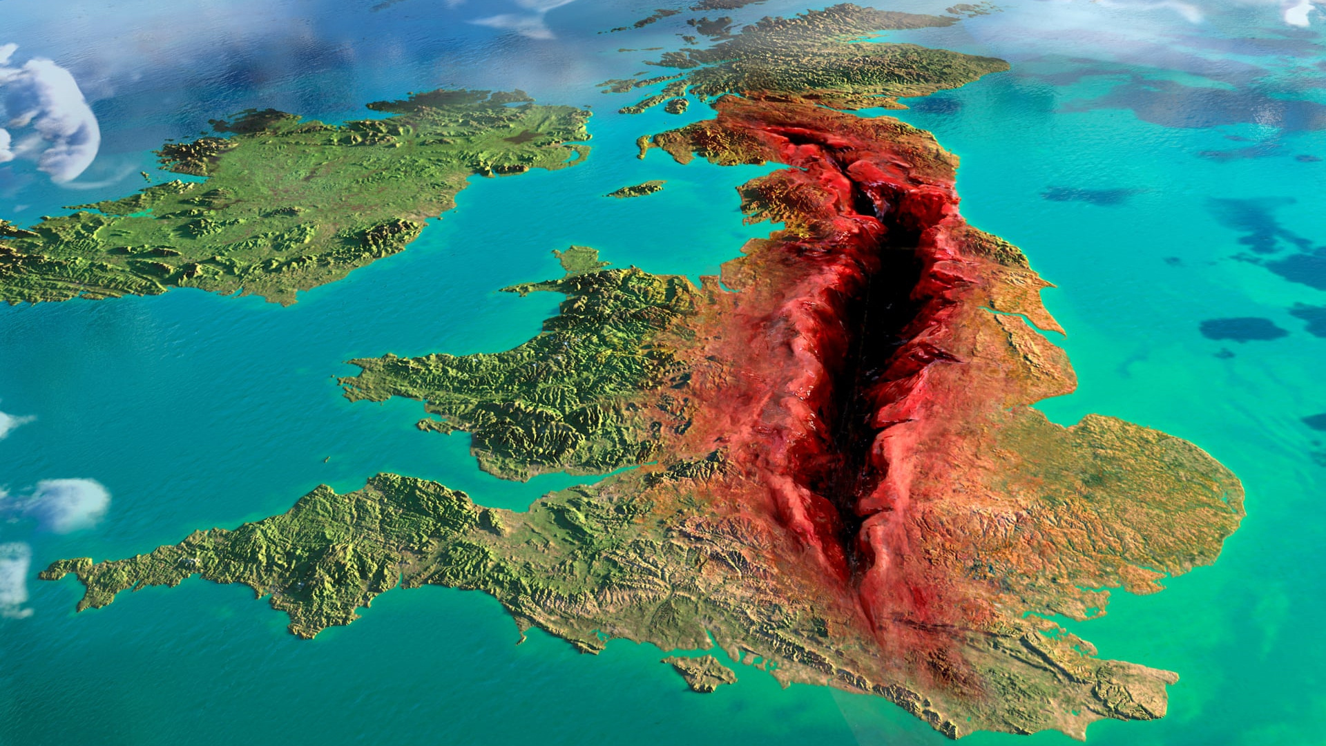
Artistic and statistic cartography projects show the U.K. divided like never before.
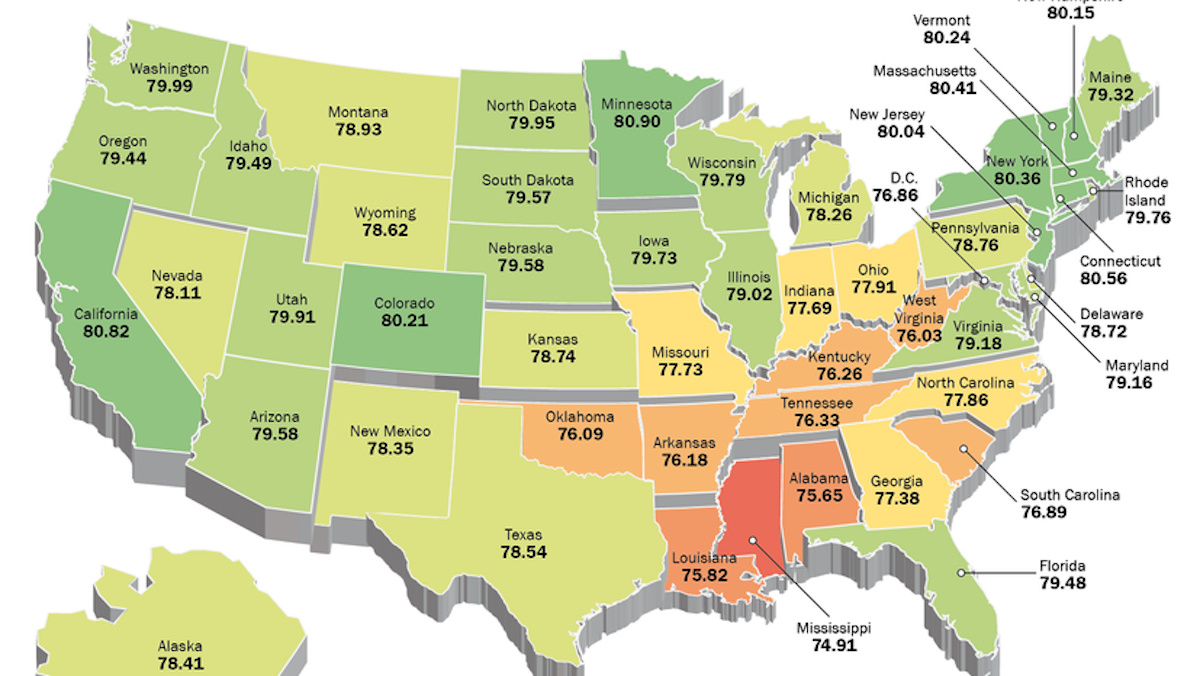
Two maps show two very different takes on the huge discrepancies in U.S. life expectancy
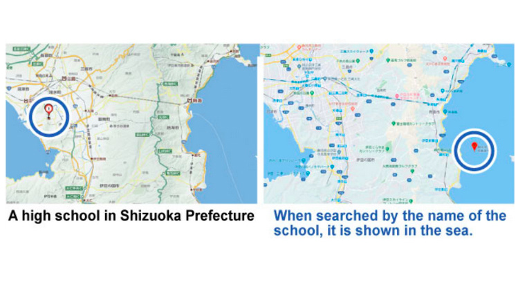
The navigation tool has placed a school in the sea, among other things.
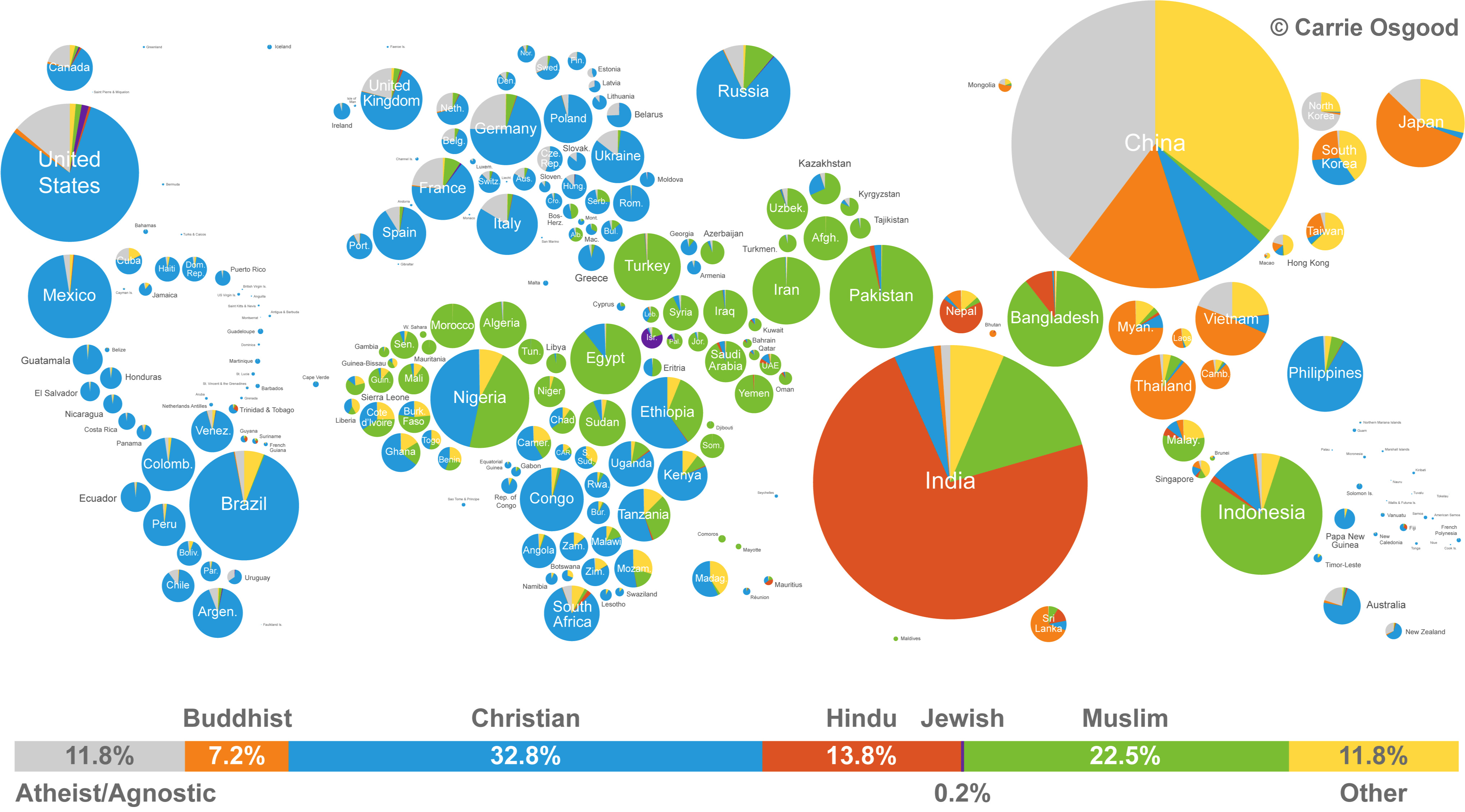
Both panoramic and detailed, this infographic manages to show both the size and distribution of world religions.

Three scientists publish a paper proving that Mercury, not Venus, is the closest planet to Earth.
▸
with
Tracking project establishes northern Argentina is wintering ground of Swainson’s hawks

Less than a mile long, the Dorfbahn in Serfaus is also the world’s highest metro system.
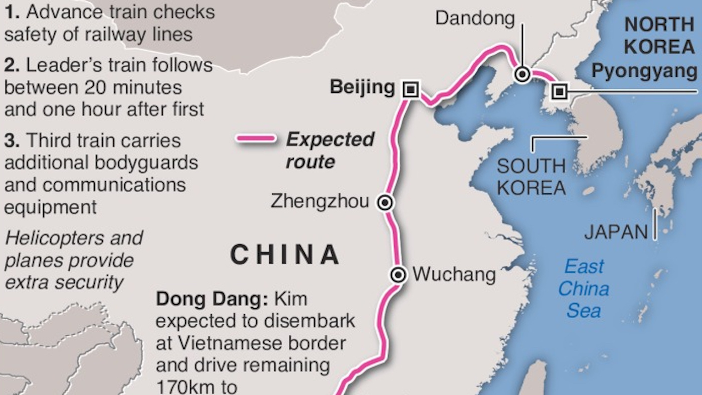
North Korea’s Great Leader would rather not fly for his second summit with Trump – but the trip is also a political message to China.

Butter supply and life satisfaction are linked — but by causation or correlation?
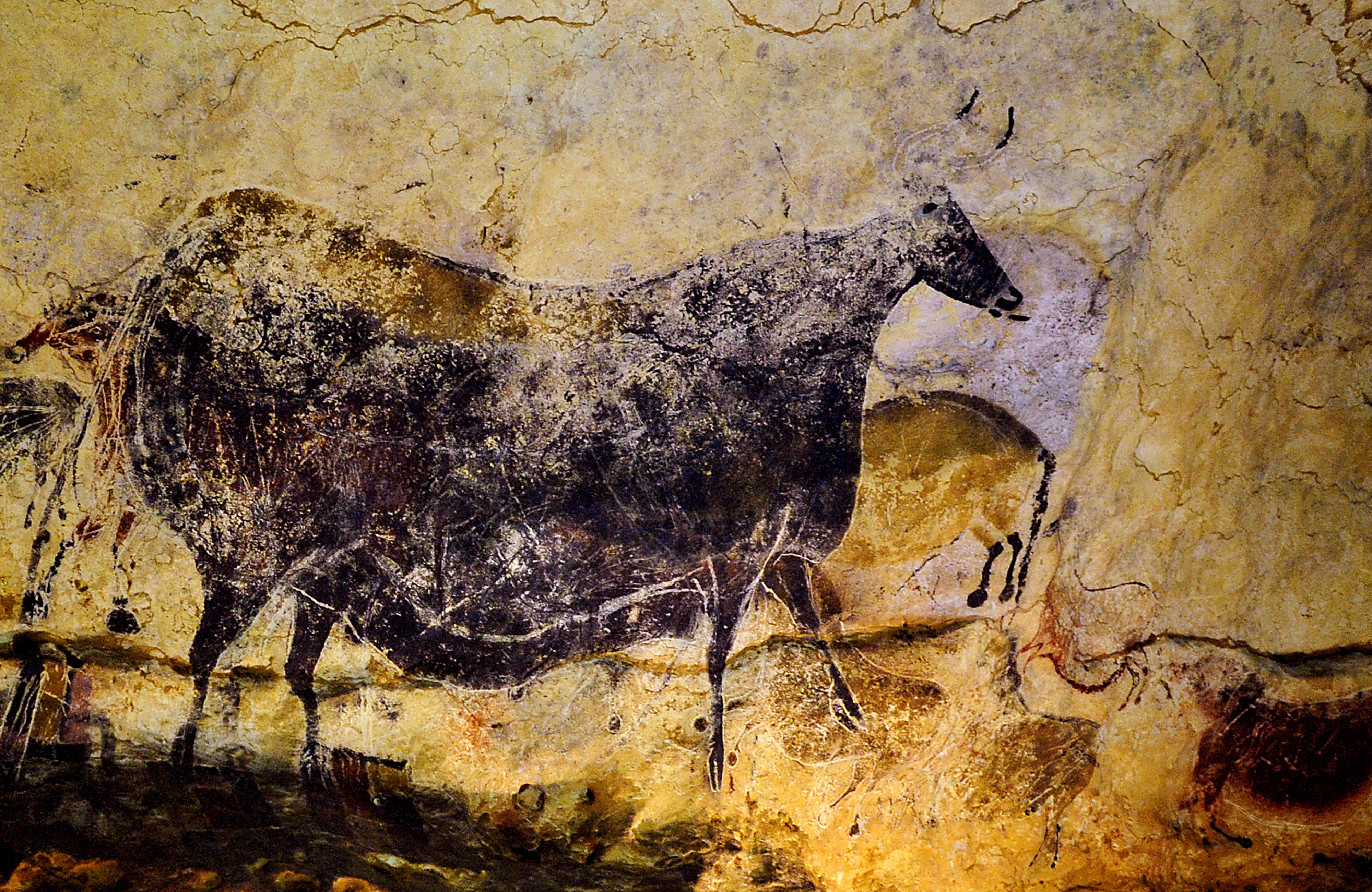
The same 32 symbols show up in prehistoric European cave art.
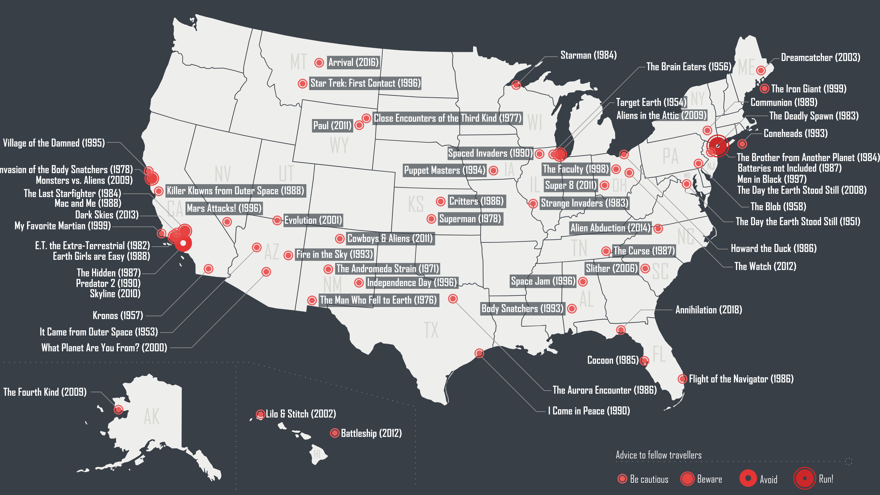
First contact movies had their Golden Age in 1980s America – now they’re going global.
Hungarian cartographer travels the world while mapping its treasures.
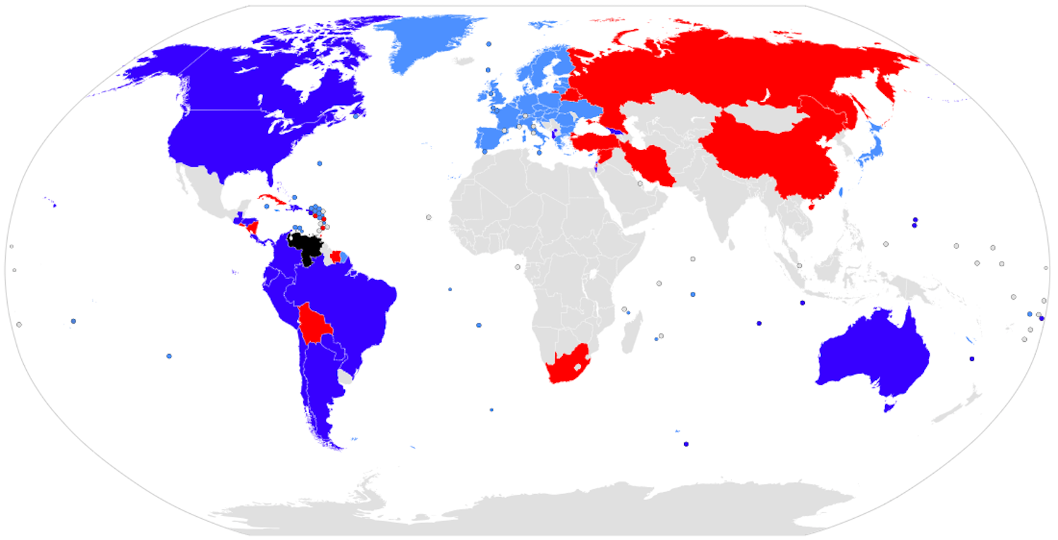
Worryingly, these are not just two random collections of countries, but two blocs with a lot of pre-existing enmity.
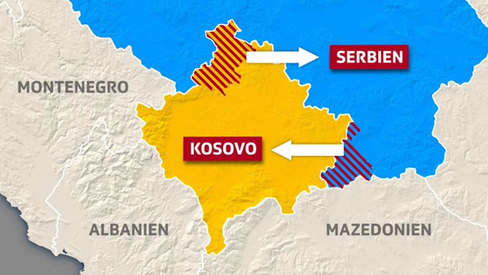
Best case: Redrawing borders leads to peace, prosperity and EU membership. But there’s also a worst case.
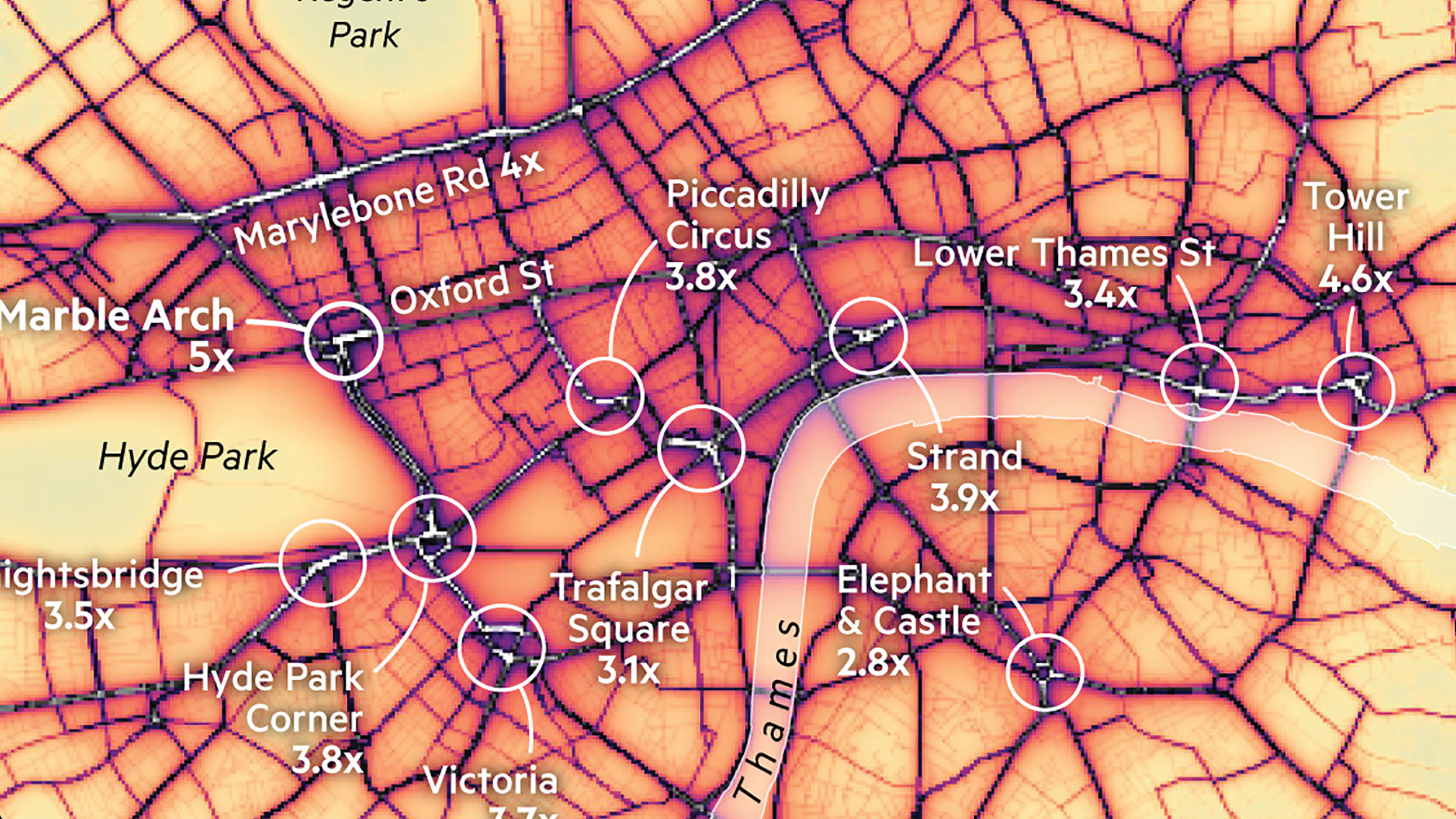
Air pollution is up to five times over the EU limit in these Central London hotspots.